An introduction to the regressinator
Alex Reinhart
Source:vignettes/regressinator.Rmd
regressinator.RmdThe regressinator is a simulation system designed to make it easy to simulate different regression scenarios. By specifying the true population distribution of the predictors, and giving the exact relationship between predictors and response variables, we can simulate samples from the population easily. We can use these samples to explore questions like:
- What do different diagnostic plots look like with different kinds of model misspecification?
- How do regression estimators behave with different populations?
- What happens to estimators when their assumptions are violated?
The regressinator is also a diagnostic package for regression models. Once a model is fit, it provides tools to extract various kind of residuals in convenient (tidy) form, to simulate from the sampling distribution of any desired model parameter, and to conduct simulation-based inference on the model fit, including visual inference with lineups.
The regressinator is intended for use in the classroom, as a tool for students to learn about regression in lab activities or homework assignments. Its flexibility makes it suitable for any regression course where students are expected to regularly use R.
Population setup
Each simulation begins by specifying a population: the true population distribution the regression data comes from. Typically this is an infinite population of individuals whose covariates follow specified distributions. The outcome variable is defined to be a function of those covariates with some error. For example, consider a population in which
\[
\begin{align*}
X_1 &\sim \operatorname{Normal}(4, 10^2) \\
X_2 &\sim \operatorname{Uniform}(0, 10) \\
Y &= 0.7 + 2.2 X_1 - 0.2 X_2 + \epsilon \\
\epsilon &\sim \operatorname{Normal}(0, 1.5^2),
\end{align*}
\] We use the population() function to define this
population:
library(regressinator)

linear_pop <- population(
  x1 = predictor(rnorm, mean = 4, sd = 10),
  x2 = predictor(runif, min = 0, max = 10),
  y = response(
    0.7 + 2.2 * x1 - 0.2 * x2, # relationship between X and Y
    family = gaussian(),       # link function and response distribution
    error_scale = 1.5          # errors are scaled by this amount
  )
)
Notice how the predictors are defined using predictor(),
each specifying its distribution (via the name of the R function used to
simulate it, such as rnorm()) and any arguments to that
distribution, such as mean or standard deviation. The response variable
is defined by response(), whose first argument gives
y as a function of the predictors. This expression can
refer to the predictors by name, and will be used to simulate the
response when sampling from the population. We can also specify the link
and error scale. By default, the error distribution is Gaussian, and as
the gaussian() family has errors with variance 1 by
default, setting the error_scale to 1.5 means the errors
have standard deviation 1.5.
More generally, population() defines a population
according to the following relationship:
\[ \begin{align*} Y &\sim \text{SomeDistribution} \\ g(\mathbb{E}[Y \mid X = x]) &= \mu(x) \\ \mu(x) &= \text{any function of } x. \end{align*} \]
The function \(\mu(x)\) is the first
argument to response(), and can be any arbitrary R
expression. The distribution is given by the family
argument, just like families of GLMs in glm(). If no family
is provided, the default family is Gaussian, i.e., normally distributed
errors, and the link function \(g\) is
the identity.
We can hence specify a population with binary outcomes and logistic link function:
logistic_pop <- population(
  x1 = predictor(rnorm, mean = 0, sd = 10),
  x2 = predictor(runif, min = 0, max = 10),
  y = response(0.7 + 2.2 * x1 - 0.2 * x2,
               family = binomial(link = "logit"))
)
This population specifies that
\[ \begin{align*} Y &\sim \text{Bernoulli}\left(\text{logit}^{-1}(\mu(X))\right) \\ \mu(X) &= 0.7 + 2.2 X_1 - 0.2 X_2. \end{align*} \]
The regressinator supports the gaussian(),
binomial(), and poisson() families from base
R, and can draw response variables accordingly.
Custom response distributions
It’s often useful to simulate data with non-standard response distributions, so we can investigate how estimators and diagnostics behave under different kinds of misspecification. The regressinator provides several custom response families to support this.
First, we can represent heteroskedasticity (unequal variance) in
linear regression by using the error_scale argument to
response(). This argument is evaluated in the sampled data
frame’s environment, meaning it can be written in terms of the
predictors. For example:
heteroskedastic_pop <- population(
  x1 = predictor(rnorm, mean = 5, sd = 4),
  x2 = predictor(runif, min = 0, max = 10),
  y = response(
    4 + 2 * x1 - 3 * x2, # relationship between X and Y
    family = ols_with_error(rnorm), # distribution of the errors
    error_scale = 0.5 + x2 / 10 # errors depend on x2
  )
)
Next, the ols_with_error() family represents an identity
link function with custom error distribution. For instance, in this
population, the errors are \(t\)-distributed with 3 degrees of
freedom:
heavy_tail_pop <- population(
  x1 = predictor(rnorm, mean = 5, sd = 4),
  x2 = predictor(runif, min = 0, max = 10),
  y = response(
    4 + 2 * x1 - 3 * x2, # relationship between X and Y
    family = ols_with_error(rt, df = 3), # distribution of the errors
    error_scale = 1.0 # errors are multiplied by this scale factor
  )
)
Again, we can use error_scale to scale the error
distribution to change its overall variance, and the
error_scale can depend on the predictors.
Finally, use custom_family() to represent a completely
arbitrary relationship, as defined by the response distribution and
inverse link function. For instance, a zero-inflated Poisson family:
# 40% of draws have lambda = 0, the rest have lambda given by the inverse link
zeroinfpois <- function(ys) {
  n <- length(ys)
  rpois(n, lambda = ys * rbinom(n, 1, prob = 0.4))
}

pop <- population(
  x1 = predictor(rnorm, mean = 2, sd = 2),
  y = response(
    0.7 + 0.8 * x1,
    family = custom_family(zeroinfpois, exp)
  )
)
Here y is sampled by evaluating
zeroinfpois(exp(0.7 + 0.8 * x1)), and so 40% of the draws
will be 0, and the rest will come from
rpois(lambda = exp(0.7 + 0.8 * x1)). This approach could
also be used to simulate contaminated error distributions, inject
outliers, or produce other unusual error patterns.
Categorical predictors
R supports many common probability distributions, so most common
predictor variable distributions can be specified. But categorical
predictor variables (factors) are very common in practice, and so the
regressinator provides rfactor() for drawing factor
variables:
# default is equally likely levels
rfactor(5, c("foo", "bar", "baz"))
#> [1] bar foo baz bar bar
#> Levels: foo bar baz

# but probabilities per level can be specified
rfactor(5, c("foo", "bar", "baz"), c(0.4, 0.3, 0.3))
#> [1] baz baz foo bar bar
#> Levels: foo bar baz
Then, using the by_level() helper, we can use factors in
defining a regression model. For instance, here is a model with a
different intercept per group:
intercepts <- c("foo" = 2, "bar" = 30, "baz" = 7)

factor_intercept_pop <- population(
  group = predictor(rfactor,
                    levels = c("foo", "bar", "baz"),
                    prob = c(0.1, 0.6, 0.3)),
  x = predictor(runif, min = 0, max = 10),
  y = response(by_level(group, intercepts) + 0.3 * x,
               error_scale = 1.5)
)
Or, similarly, a model with a different slope per group:
Sampling from the population
We can use sample_x() to get a sample from a population.
sample_y() then works on this sample and adds a
y column, following the relationship specified in the
population.
Sampling X and Y is separated because often, in regression theory, we treat X as fixed – hence we want to conduct simulations where the same X data is used and we repeatedly draw new Y values according to the population relationship.
We can also use R pipes to put together simulations:
logistic_pop |>
  sample_x(n = 10) |>
  sample_y()
#> Sample of 10 observations from
#> Population with variables:
#> x1: rnorm(list(mean = 0, sd = 10))
#> x2: runif(list(min = 0, max = 10))
#> y: binomial(0.7 + 2.2 * x1 - 0.2 * x2, size = 1L)
#>
#> # A tibble: 10 × 3
#>        x1    x2     y
#>     <dbl> <dbl> <int>
#>  1   9.35 5.28      1
#>  2   1.76 6.01      1
#>  3   2.44 2.61      1
#>  4  16.2  2.90      1
#>  5   1.12 4.80      1
#>  6  -1.34 9.20      0
#>  7 -19.1  4.01      0
#>  8  -2.79 2.13      0
#>  9  -3.13 6.72      0
#> 10  10.7  0.586     1
The object this produces is a standard data frame (just with a few
extra attributes), so it can be given to lm(),
glm(), or any other standard modeling function that uses
data frames.
Fitting models
After we simulate a sample from a population, we can fit our chosen models to that sample. That model may simply use the predictors as-is, entering them into the design matrix and obtaining estimates through least square or maximum likelihood. But it is also common to represent the predictors differently in the model:
- Factor predictors are typically represented as several columns, for instance with one-hot encoding
- Predictors might be transformed, so the transformed version enters the model
- To fit a polynomial or spline, we might use several transformations of the predictor in the model (such as linear, squared, and cubed terms)
We call these transformed and recoded variables regressors. The coefficients of a model give the relationship between the regressors and the response, but the regressors may be transformed versions of the predictors. Many conventional diagnostics are based on the regressors, such as most residual plots, but as we will see below, others directly examine the relationship between the predictors and the response, however those predictors have been transformed and entered into the model.
We can, in principle, do almost any regression we desire. The only
constraint is that we must use the data argument to our
modeling function (such as lm() or glm()) to
provide the data. That is, we must do this:
fit <- lm(y ~ x1 + x2, data = linear_samp)But not this:
fit <- lm(linear_samp$y ~ linear_samp$x1 + linear_samp$x2)Using the data argument allows the regressinator to
conduct simulations by passing new data in that argument; if you don’t
use it and refer to your local environment, there’s no reliable way to
change the data in your model. The relevant functions will automatically
detect models without a data argument and complain.
Producing diagnostics
Once we have a sample and fit a model, we can conduct diagnostics.
Simple diagnostic plots can easily be made using
broom::augment(), which generates a data frame with columns
including the predictors, residuals, standardized residuals, fitted
value, and other useful statistics for each observation. It also works
for many common types of models; see the broom documentation for
details.
For example, consider a simple dataset where the true relationship
between x1 and y is not linear. We can quickly
plot residuals versus fitted values:
library(broom)

nonlinear_pop <- population(
  x1 = predictor(runif, min = 1, max = 8),
  x2 = predictor(runif, min = 0, max = 10),
  y = response(0.7 + x1**2 - x2, family = gaussian(),
               error_scale = 4.0)
)

nonlinear_data <- nonlinear_pop |>
  sample_x(n = 100) |>
  sample_y()

nonlinear_fit <- lm(y ~ x1 + x2, data = nonlinear_data)

# to see the kind of information we get from an augmented fit
augment(nonlinear_fit)
#> # A tibble: 100 × 9
#>        y    x1    x2 .fitted .resid   .hat .sigma   .cooksd .std.resid
#>    <dbl> <dbl> <dbl>   <dbl>  <dbl>  <dbl>  <dbl>     <dbl>      <dbl>
#>  1 43.0   6.64 3.49    41.9   1.09  0.0206   5.87 0.000248      0.188
#>  2 36.6   6.70 9.47    37.0  -0.413 0.0354   5.87 0.0000633    -0.0720
#>  3  8.64  3.83 2.16    16.7  -8.04  0.0221   5.82 0.0146       -1.39
#>  4  4.54  2.53 0.321    6.14 -1.59  0.0467   5.87 0.00127      -0.279
#>  5 18.9   3.93 1.45    18.3   0.619 0.0267   5.87 0.000105      0.107
#>  6 27.2   5.68 8.54    28.3  -1.13  0.0229   5.87 0.000298     -0.195
#>  7 19.5   4.55 2.13    23.5  -4.08  0.0202   5.86 0.00341      -0.705
#>  8 28.8   5.62 2.10    33.6  -4.84  0.0219   5.85 0.00523      -0.837
#>  9 24.4   4.58 0.395   25.4  -0.961 0.0348   5.87 0.000337     -0.167
#> 10 41.4   6.85 9.45    38.4   2.94  0.0363   5.87 0.00330       0.513
#> # ℹ 90 more rows

library(ggplot2)

ggplot(augment(nonlinear_fit),
       aes(x = .fitted, y = .resid)) +
  geom_point() +
  labs(x = "Fitted value", y = "Residual")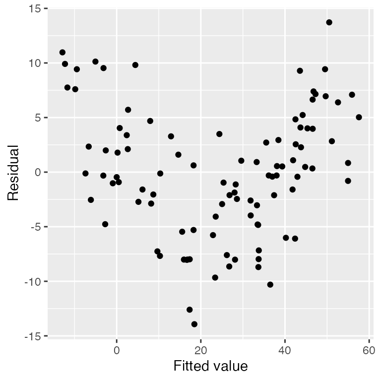
The regressinator builds on these tools to support additional
diagnostics. For example, augment_longer() is like
broom::augment(), but produces one row per predictor per
observation, essentially putting the data in “long” format. This makes
it easy to facet the data to plot residuals against each predictor:
ggplot(augment_longer(nonlinear_fit),
       aes(x = .predictor_value, y = .resid)) +
  geom_point() +
  facet_wrap(vars(.predictor_name), scales = "free") +
  labs(x = "Predictor value", y = "Residual")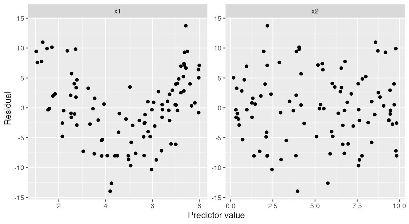
Partial residuals are an extension of ordinary residuals that are
defined in terms of each original predictor; we can think of a partial
residual plot for a particular predictor as showing the relationship
between that predictor and the response, after “adjusting for” the other
predictors according to our fitted model. The
partial_residuals() function calculates partial residuals
in tidy format, and its documentation provides detailed references on
the use and interpretation of partial residuals.
Here the black line gives the fitted predictor effects (i.e., the
model estimate of the relationship), while the blue line smooths the
partial residuals. We can see that for x1, the blue line
deviates systematically from the black line in a quadratic shape:
ggplot(partial_residuals(nonlinear_fit),
       aes(x = .predictor_value, y = .partial_resid)) +
  geom_point() + # partial residuals
  geom_smooth(se = FALSE) + # smoothed residuals
  geom_line(aes(x = .predictor_value, y = .predictor_effect)) + # effects
  facet_wrap(vars(.predictor_name), scales = "free") +
  labs(x = "Predictor value", y = "Partial residual")
#> `geom_smooth()` using method = 'loess' and formula = 'y ~ x'
If we fit a quadratic model for x1, the partial
residuals reflect this. The black line for the effect of x1
is now quadratic, and the partial residuals closely follow it:
quadratic_fit <- lm(y ~ poly(x1, 2) + x2, data = nonlinear_data)

ggplot(partial_residuals(quadratic_fit),
       aes(x = .predictor_value, y = .partial_resid)) +
  geom_point() + # partial residuals
  geom_smooth(se = FALSE) + # smoothed residuals
  geom_line(aes(x = .predictor_value, y = .predictor_effect)) + # effects
  facet_wrap(vars(.predictor_name), scales = "free") +
  labs(x = "Predictor value", y = "Partial residual")
#> `geom_smooth()` using method = 'loess' and formula = 'y ~ x'
These diagnostic functions work for linear models and also GLMs fit
by glm(). See
vignette("linear-regression-diagnostics") and
vignette("logistic-regression-diagnostics") for further
diagnostic examples.
Visual inference
It can be difficult to tell whether a particular pattern in model
diagnostics signifies a real problem or just an unlucky pattern. To help
make this judgment, the regressinator provides the
model_lineup() function. It takes a model fit and does the
following:
- Get the diagnostics from that model, using
broom::augment()by default. - Simulate 19 additional datasets using the model, using the standard assumptions for that model. (For instance, for linear regression, errors are drawn from a normal distribution.) In each dataset, the same X values are used, and only new Y values are drawn. Each dataset is the same size.
- For each of those datasets, fit the same model and calculate the diagnostics.
- Put the diagnostics for all 20 fits into one data frame with a
.samplecolumn indicating which fit each diagnostic came from. - Print out a message indicating how to tell which of the
.samplevalues comes from the original model.
This helps us compare how diagnostic plots will look when assumptions hold (by looking at the 19 simulated datasets) to how the diagnostic plots of our real model look. This visual inference approach is taken from the nullabor package.
For example, consider the same dataset where the true relationship is not linear, but we use a linear fit. We can quickly plot residuals versus fitted values:
model_lineup(nonlinear_fit) |>
  ggplot(aes(x = .fitted, y = .resid)) +
  geom_point() +
  facet_wrap(vars(.sample)) +
  labs(x = "Fitted value", y = "Residual")
#> decrypt("QUg2 qFyF Rx 8tLRyRtx ZP")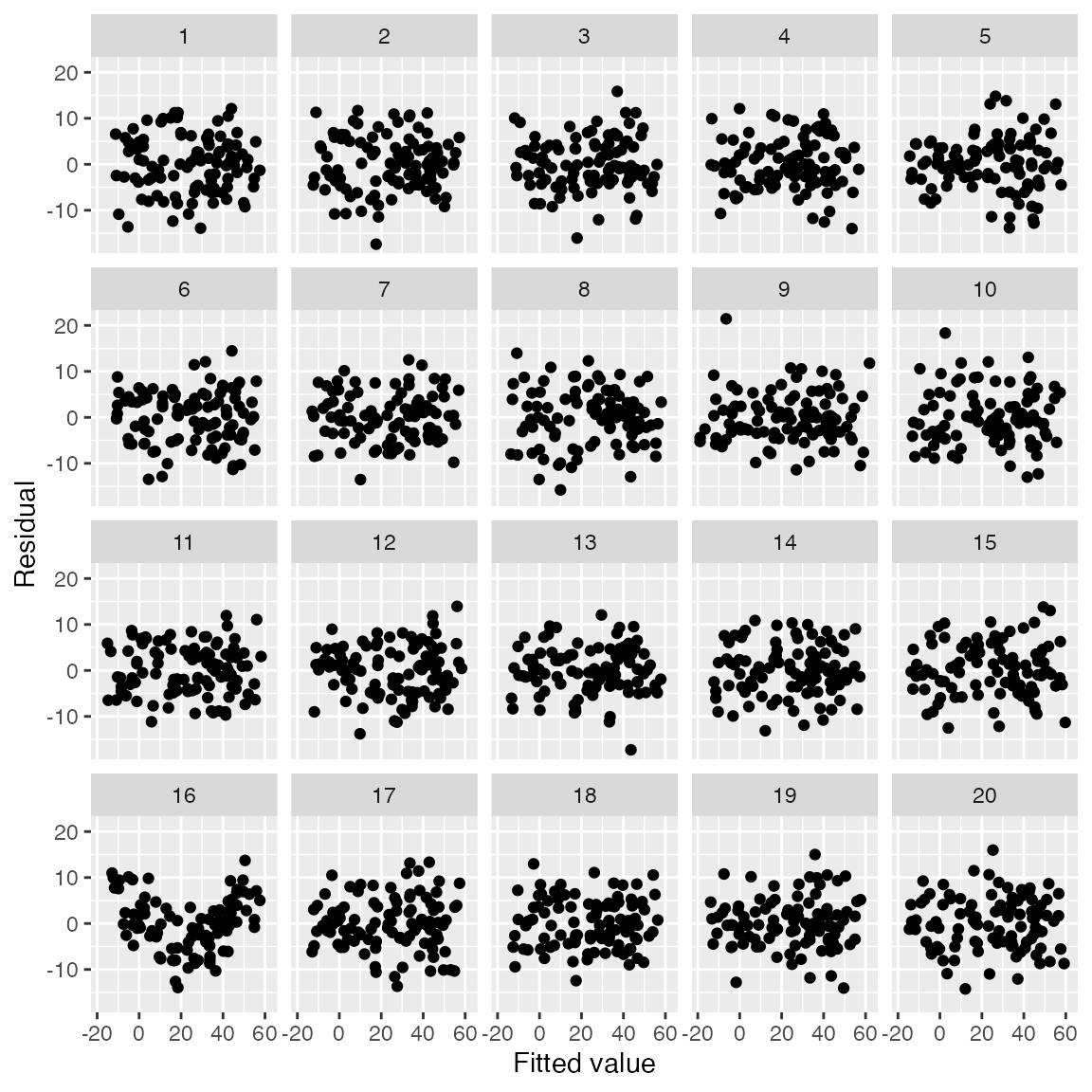
The user can examine the 20 plots and guess which one represents the
model fit to the original data, and which are generated assuming the
fitted model is correct. The decrypt() code provided will
print out a message indicating which of the plots is the real data; in
this case, it’s the plot with the clear quadratic trend in the
residuals.
This approach can be used to explore different kind of
misspecification. For example, using ols_with_error() we
can test whether we can spot non-normal residual distributions in
residual Q-Q plots:
heavy_tail_pop <- population(
  x1 = predictor(rnorm, mean = 5, sd = 4),
  x2 = predictor(runif, min = 0, max = 10),
  y = response(
    4 + 2 * x1 - 3 * x2,
    family = ols_with_error(rt, df = 3),
    error_scale = 1.0
  )
)

heavy_tail_sample <- heavy_tail_pop |>
  sample_x(n = 100) |>
  sample_y()

fit <- lm(y ~ x1 + x2, data = heavy_tail_sample)

model_lineup(fit) |>
  ggplot(aes(sample = .resid)) +
  geom_qq() +
  geom_qq_line() +
  facet_wrap(vars(.sample)) +
  labs(x = "Theoretical quantiles", y = "Observed quantiles")
#> decrypt("QUg2 qFyF Rx 8tLRyRtx Zf")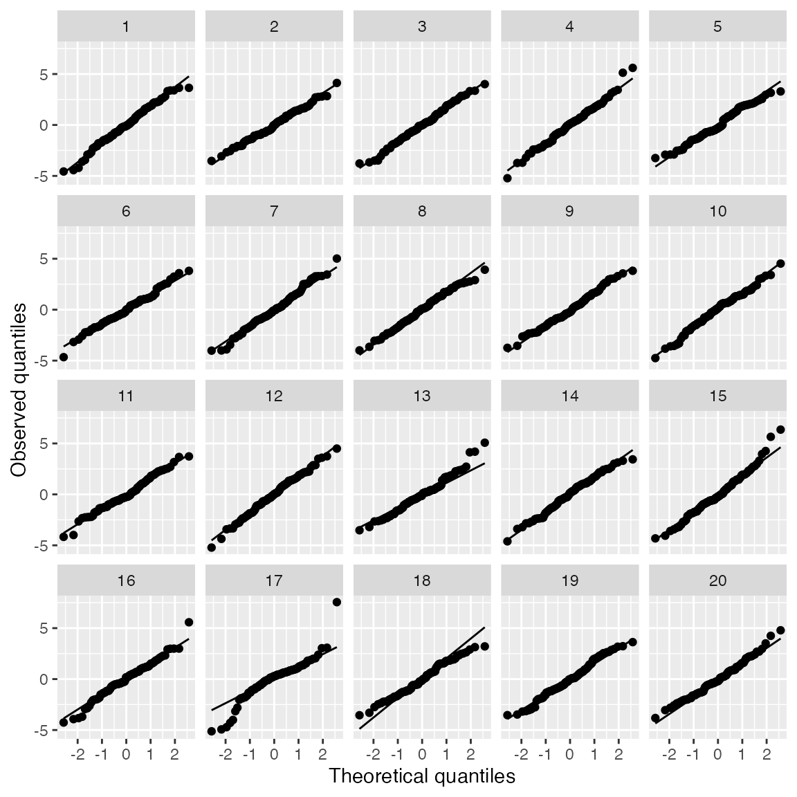
Here we have Q-Q plots of residuals for a linear regression where the true relationship is linear, but the error distribution is \(t_3\). This is a good way to see if we can spot the heavy-tailed distribution from among the 19 other Q-Q plots that simulate normally distributed errors.
Sampling distributions
The sampling_distribution() function allows you to
explore the sampling distribution of statistics and estimates from
models fit to a population. Given a dataset drawn from a
population() and a model fit to that data, it will:
- Draw repeated samples from the population. These can be with the predictors held fixed, only resampling the response, or can be new samples of predictors and response jointly. Each sample is the same size as the original dataset.
- For each sample, refit the model to that sample.
- For each model fit, apply a function to get features of the model fit.
- Combine all the results into a single data frame.
By default, the function applied to each fit is
broom::tidy(), which can take many types of model fits and
produce a data frame of the model coefficients and their standard
errors.
We can hence explore the sampling distribution of estimates fit to samples from a population:
d <- linear_pop |>
  sample_x(n = 30) |>
  sample_y()

fit <- lm(y ~ x1 + x2, data = d)
tidy(fit)
#> # A tibble: 3 × 5
#>   term        estimate std.error statistic  p.value
#>   <chr>          <dbl>     <dbl>     <dbl>    <dbl>
#> 1 (Intercept)    0.152    0.699      0.218 8.29e- 1
#> 2 x1             2.12     0.0502    42.2   3.47e-26
#> 3 x2            -0.116    0.119     -0.974 3.39e- 1

sampling_distribution(fit, d, nsim = 4)
#> # A tibble: 15 × 6
#>    term        estimate std.error statistic  p.value .sample
#>    <chr>          <dbl>     <dbl>     <dbl>    <dbl>   <dbl>
#>  1 (Intercept)    0.152    0.699      0.218 8.29e- 1       0
#>  2 x1             2.12     0.0502    42.2   3.47e-26       0
#>  3 x2            -0.116    0.119     -0.974 3.39e- 1       0
#>  4 (Intercept)    0.260    0.627      0.414 6.82e- 1       1
#>  5 x1             2.27     0.0451    50.3   3.16e-28       1
#>  6 x2            -0.155    0.106     -1.46  1.57e- 1       1
#>  7 (Intercept)    1.30     0.518      2.51  1.85e- 2       2
#>  8 x1             2.26     0.0372    60.6   2.14e-30       2
#>  9 x2            -0.268    0.0879    -3.05  5.06e- 3       2
#> 10 (Intercept)    0.307    0.650      0.473 6.40e- 1       3
#> 11 x1             2.22     0.0467    47.5   1.49e-27       3
#> 12 x2            -0.130    0.110     -1.18  2.48e- 1       3
#> 13 (Intercept)    0.204    0.701      0.291 7.74e- 1       4
#> 14 x1             2.17     0.0504    43.1   2.02e-26       4
#> 15 x2            -0.151    0.119     -1.27  2.15e- 1       4
Because the output is a tidy data frame, it’s easy to visualize the full sampling distributions:
samples <- sampling_distribution(fit, d, nsim = 1000)

samples |>
  ggplot(aes(x = estimate)) +
  geom_histogram() +
  facet_wrap(vars(term), scales = "free") +
  labs(x = "Estimate", y = "Frequency")
#> `stat_bin()` using `bins = 30`. Pick better value with `binwidth`.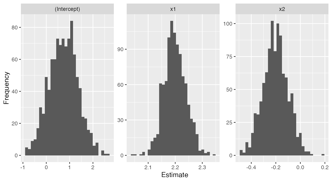
Or to get the mean and standard deviation of the sampling distribution:
library(dplyr)

samples |>
  group_by(term) |>
  summarize(mean = mean(estimate),
            sd = sd(estimate))
#> # A tibble: 3 × 3
#>   term          mean     sd
#>   <chr>        <dbl>  <dbl>
#> 1 (Intercept)  0.731 0.613
#> 2 x1           2.20  0.0407
#> 3 x2          -0.203 0.101
We could use this feature to explore how sampling distributions change as we change the sample size, change the complexity of the model, or introduce various types of model misspecification.
Parametric bootstrapping
The parametric_boot_distribution() function allows you
to explore the distribution of statistics and estimates from models fit
to data sampled from the model fit. Given a fitted model, it
will:
- Draw repeated samples from the model. The predictors are held fixed and the model is used to sample new response values, following the response and error distributions assumed by the model.
- For each sample, refit a model to that sample. This could be the same model used to simulate the sample, for instance to explore diagnostics when the model is true, or an alternative model.
- For each model fit, apply a function to get features of that model fit.
- Combined all the results in to a single data frame.
As with sampling_distribution(), the default function
applied to each fit is broom::tidy().
This function is used by model_lineup() to generate the
“null” diagnostics. It could also be used for hypothesis testing. For
example, let’s consider the nonlinear example set up above. The data
nonlinear_data comes from a population where the true
relationship between y and x1 is quadratic,
but nonlinear_fit is a model fit with only a linear term.
If we did not know a quadratic term was necessary and wanted to conduct
a test, we could use an F test:
quadratic_fit <- lm(y ~ x1 + I(x1^2) + x2, data = nonlinear_data)

anova(nonlinear_fit, quadratic_fit)
#> Analysis of Variance Table
#>
#> Model 1: y ~ x1 + x2
#> Model 2: y ~ x1 + I(x1^2) + x2
#>   Res.Df    RSS Df Sum of Sq      F    Pr(>F)
#> 1     97 3312.4
#> 2     96 1740.9  1    1571.5 86.657 4.542e-15 ***
#> ---
#> Signif. codes:  0 '***' 0.001 '**' 0.01 '*' 0.05 '.' 0.1 ' ' 1
This suggests the quadratic term is useful, as we would expect when
the true relationship is quadratic and we have an adequate sample size.
But if for some reason we do not want to use an F test, or if
we are teaching simulation-based inference, we could instead use the
parametric bootstrap. Under the null hypothesis, there is no quadratic
relationship, so we simulate the null distribution of coefficient values
under this null by simulating from nonlinear_fit and
refitting quadratic_fit:
quadratic_coefs <- parametric_boot_distribution(nonlinear_fit, quadratic_fit,
                                                data = nonlinear_data) |>
  filter(term == "I(x1^2)")

ggplot(quadratic_coefs, aes(x = estimate)) +
  geom_histogram() +
  geom_vline(xintercept = coef(quadratic_fit)["I(x1^2)"],
             color = "red") +
  labs(x = "Quadratic term coefficient",
       y = "Count",
       title = "Null distribution of quadratic term")
#> `stat_bin()` using `bins = 30`. Pick better value with `binwidth`.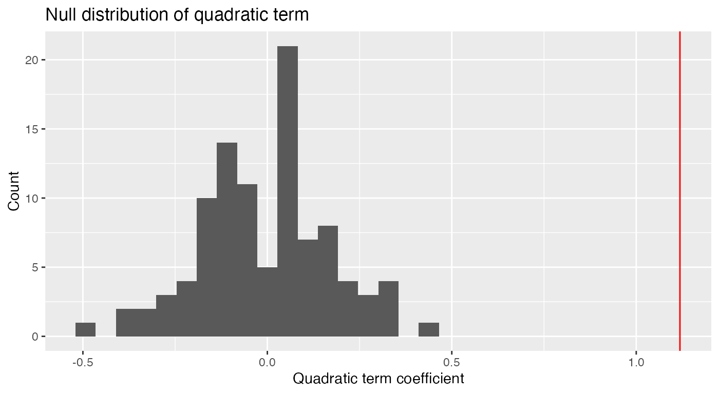
We see the quadratic coefficient estimated on the original data (vertical red line) is far larger than any of the quadratic coefficients estimated when the null is true, leading us to reject the null hypothesis that the quadratic coefficient is zero.