Logistic regression diagnostics
Source:vignettes/logistic-regression-diagnostics.Rmd
logistic-regression-diagnostics.RmdFor these examples of logistic regression diagnostics, we’ll consider a simple bivariate setting where the model is misspecified:
logistic_pop <- population(
  x1 = predictor(rnorm, mean = 0, sd = 10),
  x2 = predictor(runif, min = 0, max = 10),
  y = response(0.7 + 0.2 * x1 + x1^2 / 100 - 0.2 * x2,
               family = binomial(link = "logit"))
)

logistic_data <- sample_x(logistic_pop, n = 100) |>
  sample_y()

fit <- glm(y ~ x1 + x2, data = logistic_data, family = binomial)
In other words, the population relationship is \[ \begin{align*} Y \mid X = x &\sim \text{Bernoulli}(\mu(x)) \\ \mu(x) &= \operatorname{logit}^{-1}\left(0.7 + 0.2 x_1 + \frac{x_1^2}{100} - 0.2 x_2\right), \end{align*} \] but we chose to fit a model that does not allow a quadratic term for \(x_1\).
Empirical logit plots
Before fitting the model, we might conduct exploratory data analysis to determine what model is appropriate. In linear regression, scatterplots of the predictors versus the response variable would be helpful, but with a binary outcome these are much harder to interpret.
Instead, an empirical logit plot can help us visualize the
relationship between predictor and response. We break the range of
x1 into bins, and within each bin, calculate the mean value
of x1 and y for observations in that bin. We
then transform the mean of y through the link function; in
logistic regression, this is the logit, so we transform from a fraction
to the log-odds. If the logistic model is well-specified,
x1 and the logit of y should be linearly
related. The logits of 0 and 1 are \(-\infty\) and \(+\infty\), so taking averages of
y within bins ensures the logits are on a more reasonable
range.
The bin_by_quantile() function groups the data into
bins, while empirical_link() can calculate the empirical
value of a variable on the link scale, for any GLM family:
logistic_data |>
  bin_by_quantile(x1, breaks = 6) |>
  summarize(x = mean(x1),
            response = empirical_link(y, binomial)) |>
  ggplot(aes(x = x, y = response)) +
  geom_point() +
  labs(x = "X1", y = "logit(Y)")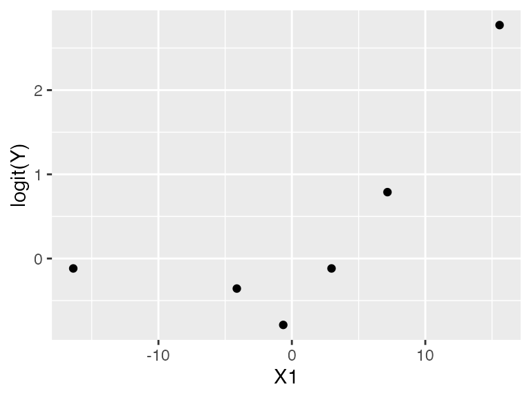
This looks suspiciously nonlinear.
Similarly for x2:
logistic_data |>
  bin_by_quantile(x2, breaks = 6) |>
  summarize(x = mean(x2),
            response = empirical_link(y, binomial)) |>
  ggplot(aes(x = x, y = response)) +
  geom_point() +
  labs(x = "X2", y = "logit(Y)")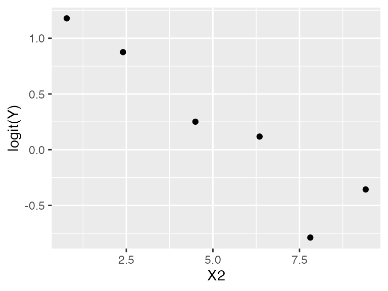
This looks more linear, though it is difficult to assess. We could
also use model_lineup() to examine similar plots when the
model is correctly specified, to tell if these plots indicate a serious
problem.
Naive residual plots
Once we have fit the model, ordinary standardized residuals are not very helpful for noticing the misspecification:
augment(fit) |>
  ggplot(aes(x = .fitted, y = .std.resid)) +
  geom_point() +
  geom_smooth(se = FALSE) +
  labs(x = "Fitted value", y = "Residual")
#> `geom_smooth()` using method = 'loess' and formula = 'y ~ x'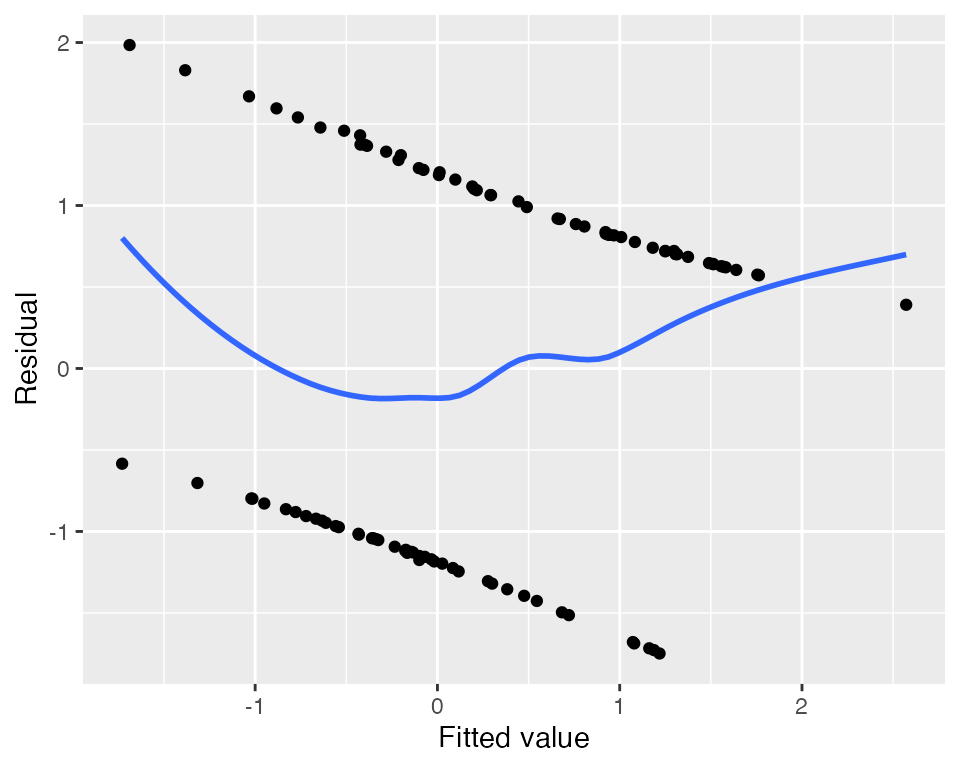
Nor are plots of standardized residuals against the predictors:
augment_longer(fit) |>
  ggplot(aes(x = .predictor_value, y = .std.resid)) +
  geom_point() +
  geom_smooth(se = FALSE) +
  facet_wrap(vars(.predictor_name), scales = "free_x") +
  labs(x = "Predictor", y = "Residual")
#> `geom_smooth()` using method = 'loess' and formula = 'y ~ x'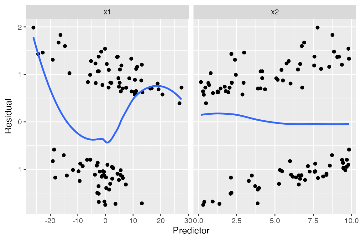
We see a hint of something in the smoothed line on the left, but it is hard to judge what that means. Because our outcome is binary, the residuals are divided into two clumps (\(Y = 0\) and \(Y = 1\)), making their distribution hard to interpret and trends hard to spot.
Marginal model plots
For each predictor, we plot the predictor versus \(Y\). We plot the smoothed curve of fitted values (red) as well as a smoothed curve of response values (blue):
augment_longer(fit, type.predict = "response") |>
  ggplot(aes(x = .predictor_value)) +
  geom_point(aes(y = y)) +
  geom_smooth(aes(y = .fitted), color = "red") +
  geom_smooth(aes(y = y)) +
  facet_wrap(vars(.predictor_name), scales = "free_x") +
  labs(x = "Predictor", y = "Y")
#> `geom_smooth()` using method = 'loess' and formula = 'y ~ x'
#> `geom_smooth()` using method = 'loess' and formula = 'y ~ x'
The red line is a smoothed version of \(\hat \mu(x)\) versus \(X_1\), while the blue line averages \(Y\) (which is 0 or 1, so the average is the true fraction of 1s) versus \(X_1\). Comparing the two lines helps us evaluate if the model is well-specified.
This again suggests something may be going on with x1,
but it’s hard to tell what specifically might be wrong.
Partial residuals
The partial residuals make the quadratic shape of the relationship much clearer:
partial_residuals(fit) |>
  ggplot(aes(x = .predictor_value, y = .partial_resid)) +
  geom_point() +
  geom_smooth() +
  geom_line(aes(x = .predictor_value, y = .predictor_effect)) +
  facet_wrap(vars(.predictor_name), scales = "free") +
  labs(x = "Predictor", y = "Partial residual")
#> `geom_smooth()` using method = 'loess' and formula = 'y ~ x'
The partial residuals show the shape of the relationship on the
link scale, before the nonlinear transformation, making it
easier to determine how to change the linear predictor. See the
partial_residuals() documentation for more information how
these are computed and interpreted.
Binned residuals
Binned residuals bin the observations based on their predictor values, and average the residual value in each bin. This avoids the problem that individual residuals are hard to interpret because \(Y\) is only 0 or 1:
binned_residuals(fit) |>
  ggplot(aes(x = predictor_mean, y = resid_mean)) +
  facet_wrap(vars(predictor_name), scales = "free") +
  geom_point() +
  labs(x = "Predictor", y = "Residual mean")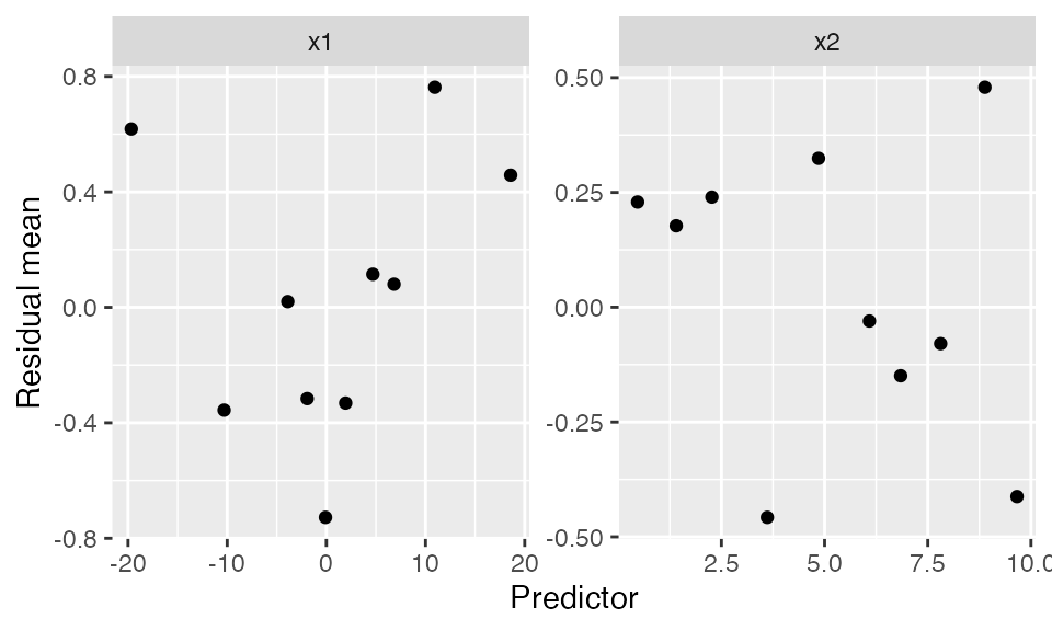
This is comparable to the marginal model plots above: where the marginal model plots show a smoothed curve of fitted values and a smoothed curve of actual values, the binned residuals show the average residuals, which are actual values minus fitted values. We can think of the binned residual plot as showing the difference between the lines in the marginal model plot.
We can also bin by the fitted values of the model:
binned_residuals(fit, predictor = .fitted) |>
  ggplot(aes(x = predictor_mean, y = resid_mean)) +
  geom_point() +
  labs(x = "Fitted values", y = "Residual mean")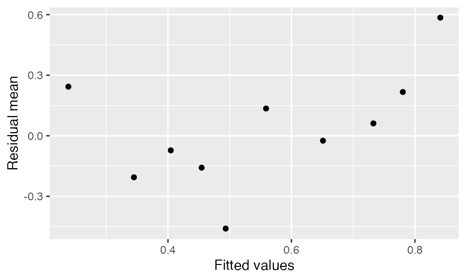
Randomized quantile residuals
Randomized quantile residuals are intended to solve the obvious
problem of ordinary residual plots: because \(Y\) is binary, the residuals have a very
strange distribution and obvious patterns, even when the model is
perfectly specified. Randomized quantile residuals use randomization to
essentially jitter the pattern away; see the
augment_quantile() documentation for technical details. The
result is residuals that should be uniformly distributed when the model
is correctly specified.
As with other residuals, we can plot the randomized quantile residuals against the fitted values or against the predictors:
augment_quantile(fit) |>
  ggplot(aes(x = .fitted, y = .quantile.resid)) +
  geom_point() +
  geom_smooth(se = FALSE) +
  labs(x = "Fitted value", y = "Randomized quantile residual")
#> `geom_smooth()` using method = 'loess' and formula = 'y ~ x'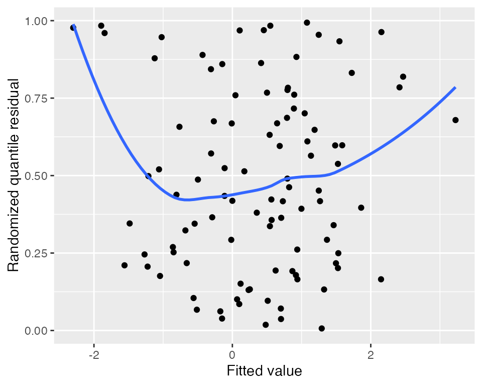
augment_quantile_longer(fit) |>
  ggplot(aes(x = .predictor_value, y = .quantile.resid)) +
  geom_point() +
  geom_smooth(se = FALSE) +
  facet_wrap(vars(.predictor_name), scales = "free_x") +
  labs(x = "Predictor", y = "Randomized quantile residual")
#> `geom_smooth()` using method = 'loess' and formula = 'y ~ x'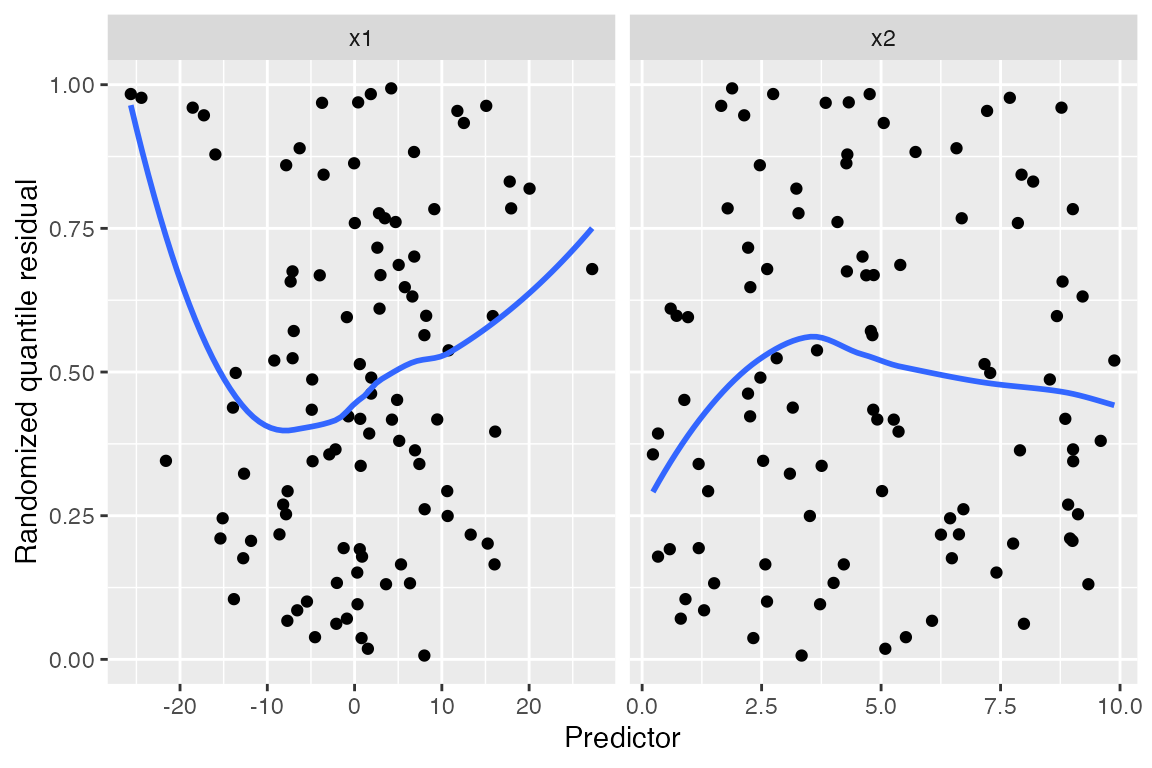
The plot against x1 makes the quadratic shape clear. If
the model were correctly specified, the residuals would be uniformly
distributed regardless of the value of \(X\), but instead we see a curved trend
indicating the problem. The randomization has made the plots much easier
to read than ordinary standardized residuals, with their strange banded
patterns that occur even when the model is correct.