Linear regression diagnostics
Source:vignettes/linear-regression-diagnostics.Rmd
linear-regression-diagnostics.RmdThe basic linear regression model assumes that \[ Y = \beta_0 + \beta_1 X_1 + \dots + \beta_p X_p + \epsilon, \] where \(\epsilon\) has mean zero and variance \(\sigma^2\). The regressors \(X_1, \dots, X_p\) might be the original predictors, or could be transformations and combinations of them, such as interactions or polynomials. The assumptions on the distribution of \(\epsilon\) are used to obtain the variance of \(\hat \beta\) and hence are important for inference, while the assumption of a linear relationship determines whether our mean function is accurate.
For these examples, we’ll consider a simple multivariate setting where the population relationship is nonlinear and we misspecify the model:
nonlinear_pop <- population(
  x1 = predictor(runif, min = 1, max = 8),
  x2 = predictor(runif, min = 4, max = 12),
  y = response(0.7 + 0.8 * x1**2 + 1.2 * x2,
               family = gaussian(), error_scale = 4.0)
)

nonlinear_data <- sample_x(nonlinear_pop, n = 100) |>
  sample_y()

fit <- lm(y ~ x1 + x2, data = nonlinear_data)
We’ll use broom::augment() to get diagnostic information
from the fit in a standardized data frame, making it easy to use ggplot2
to produce different diagnostic plots.
Residual plots
Residual plots can detect misspecification of the mean function. When we plot the residuals against any linear combination of the regressors, they should have mean zero and constant variance. If they do not, the model may be incorrect.
One such linear combination is the fitted values \(\hat Y\). We can obtain the residuals and
fitted values from broom::augment():
augment(fit) |>
  ggplot(aes(x = .fitted, y = .resid)) +
  geom_point() +
  geom_smooth(se = FALSE) +
  labs(x = "Fitted value", y = "Residual")
#> `geom_smooth()` using method = 'loess' and formula = 'y ~ x'
There is a suspicious trend here, but it is hard to tell what specifically is wrong from the model from this. It would be more helpful to know which predictor is modeled incorrectly.
To plot residuals versus the regressors, the regressinator provides
augment_longer(), which is like augment() but
converts the data to long form with one row per predictor per
observation, making it easy to facet the residuals:
augment_longer(fit) |>
  ggplot(aes(x = .predictor_value, y = .resid)) +
  geom_point() +
  geom_smooth(se = FALSE) +
  facet_wrap(vars(.predictor_name), scales = "free_x") +
  labs(x = "Predictor", y = "Residual")
#> `geom_smooth()` using method = 'loess' and formula = 'y ~ x'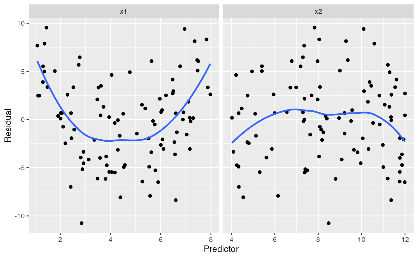
The trend in the residuals against x1 makes it clear
that something is wrong with our specification of x1 in the
model, which is correct: we modeled it as linear when it should be
quadratic.
Detecting misspecification is a matter of judgment, as the residuals
are random and trends can appear even when the model is well-specified.
Using model_lineup(), we can compare the true residual
plots to several where the model is correctly specified. Each row gives
the plots for one simulation, and one of the fives rows (at random) is
the true residual plots:
model_lineup(fit, fn = augment_longer, n = 5) |>
  ggplot(aes(x = .predictor_value, y = .resid)) +
  geom_point() +
  geom_smooth(se = FALSE) +
  facet_grid(rows = vars(.sample), cols = vars(.predictor_name),
             scales = "free_x") +
  labs(x = "Predictor", y = "Residual")
#> decrypt("gOh4 kDUD pB 9RtpUpRB vw")
#> `geom_smooth()` using method = 'loess' and formula = 'y ~ x'
This gives a sense of the variation to be expected when the model is well-specified. It should still be easy to spot the row containing the plots for our misspecified model.
Partial residual plots
The partial_residuals() function fetches partial
residuals in a convenient data frame format. Partial residuals are
defined in terms of the original predictors, not the regressors; we can
think of a partial residual plot for a particular predictor as showing
the relationship between that predictor and the response, after
“adjusting for” the other predictors according to our fitted model. See
the function documentation for references on the use and interpretation
of partial residuals.
Detecting basic misspecification
Here the black line gives the fitted predictor effects (i.e. the
model estimate of the relationship), while the blue line smooths the
partial residuals. We can see that for x1, the blue line
deviates systematically from the black line:
partial_residuals(fit) |>
  ggplot(aes(x = .predictor_value, y = .partial_resid)) +
  geom_point() + # partial residuals
  geom_smooth(se = FALSE) + # smoothed residuals
  geom_line(aes(x = .predictor_value, y = .predictor_effect)) + # effects
  facet_wrap(vars(.predictor_name), scales = "free") +
  labs(x = "Predictor", y = "Partial residual")
#> `geom_smooth()` using method = 'loess' and formula = 'y ~ x'
The shape of the blue line approximates the shape of the true
relationship between x1 and the response (provided the rest
of the model is well-specified!), so we can use its shape to determine
how to change our model.
We can again use model_lineup() to see how these compare
to the partial residuals when the model is correctly specified:
model_lineup(fit, partial_residuals, n = 5) |>
  ggplot(aes(x = .predictor_value, y = .partial_resid)) +
  geom_point() +
  geom_smooth(se = FALSE) +
  geom_line(aes(x = .predictor_value, y = .predictor_effect)) +
  facet_grid(rows = vars(.sample), cols = vars(.predictor_name),
             scales = "free") +
  labs(x = "Predictor", y = "Partial residual")
#> decrypt("gOh4 kDUD pB 9RtpUpRB vv")
#> `geom_smooth()` using method = 'loess' and formula = 'y ~ x'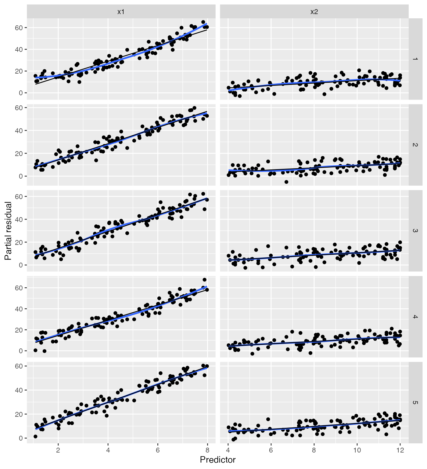
In the plots where the model is correctly specified, the blue and black lines coincide, making it easy to spot the misspecified model.
Checking for interactions
Partial residuals can also be used to detect interaction terms that should be included in the model. For example, let’s define a population in which \(X_2\) is a factor variable with two levels, and the slope and intercept of the relationship between \(X_1\) and \(Y\) depend on the value of \(X_2\).
intercepts <- c(
  "foo" = -0.3,
  "bar" = 1.7
)

slopes <- c(
  "foo" = 1.8,
  "bar" = -0.4
)

interact_pop <- population(
  x1 = predictor(runif, min = 1, max = 8),
  x2 = predictor(rfactor, levels = c("foo", "bar")),
  y = response(by_level(x2, intercepts) + by_level(x2, slopes) * x1,
               family = gaussian(), error_scale = 4.0)
)

interact_data <- sample_x(interact_pop, n = 100) |>
  sample_y()

no_interact_fit <- lm(y ~ x1 + x2, data = interact_data)
We have fit a model that does not account for the interaction, allowing a different intercept for the two groups but forcing the slope of \(X_1\) to be the same. If we are concerned the interaction may be present, we can make the conventional partial residual plot, but with the points colored by the value of \(X_2\):
partial_residuals(no_interact_fit) |>
  ggplot(aes(x = .predictor_value, y = .partial_resid, color = x2)) +
  geom_point() + # partial residuals
  geom_smooth(se = FALSE) + # smoothed residuals
  geom_line(aes(x = .predictor_value, y = .predictor_effect, color = NULL)) + # effects
  facet_wrap(vars(.predictor_name), scales = "free") +
  labs(x = "Predictor", y = "Partial residual")
#> Factor predictors were dropped:
#> • `x2`
#> `geom_smooth()` using method = 'loess' and formula = 'y ~ x'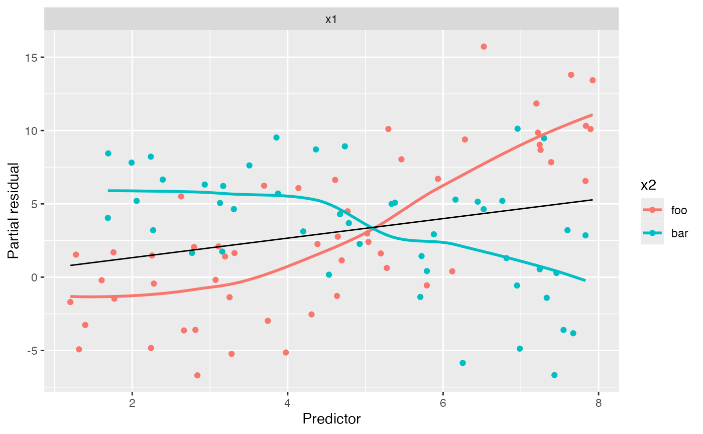
Notice the very distinct smoothing lines: the foo group
appears to have a much steeper slope than the bar group.
This is in fact true in the population. This may alert us that while our
average slope is accurate, and the relationship appears reasonably
linear, the slope may differ for the groups. We could, of course,
produce a lineup to assess if the slope difference is significant, but
it appears fairly large here.
We can now fit a model with the interaction term and generate partial residuals again:
interact_fit <- lm(y ~ x1 * x2, data = interact_data)

partial_residuals(interact_fit) |>
  ggplot(aes(x = .predictor_value, y = .partial_resid, color = x2)) +
  geom_point() + # partial residuals
  geom_smooth(se = FALSE) + # smoothed residuals
  geom_line(aes(x = .predictor_value, y = .predictor_effect, color = NULL)) + # effects
  facet_wrap(vars(.predictor_name), scales = "free") +
  labs(x = "Predictor", y = "Partial residual")
#> Factor predictors were dropped:
#> • `x2`
#> `geom_smooth()` using method = 'loess' and formula = 'y ~ x'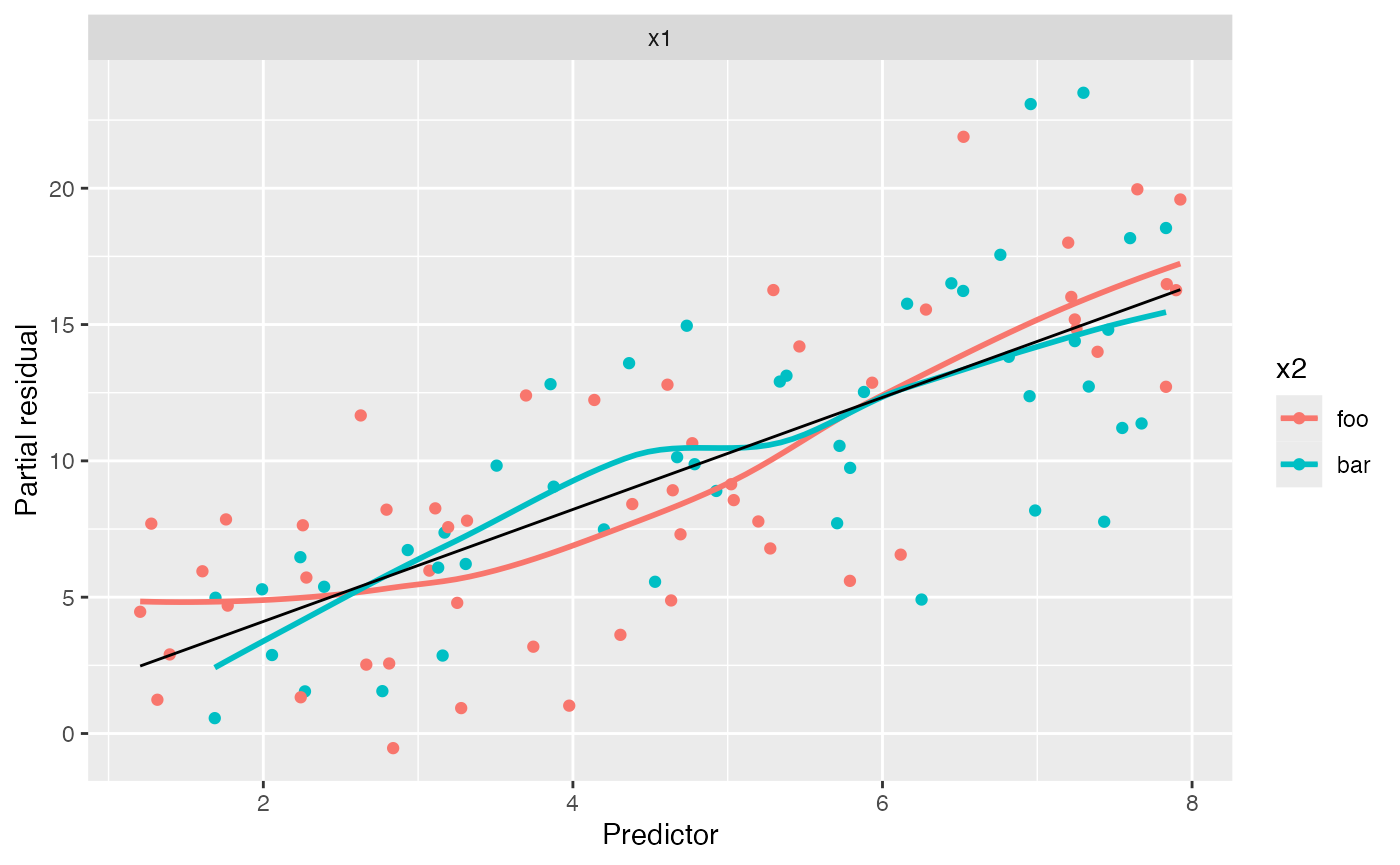
In this plot, both groups appear to have the same linear trend, and so adding the interaction appears to have been a good idea.
Note the positive slope in this plot. In the calculation of partial
residuals for \(X_1\), all other
predictors are set to 0 or their baseline level, so \(X_2\) is set to foo. Hence the
overall slope is approximately 1.8, even for points with \(X_2 = \text{bar}\), which can be
confusing.
Cook’s distances
The Cook’s distance for an observation represents how much the model fitted values would change if that observation were removed, scaled by the model’s mean squared error. A Cook’s distance of 1 is often considered a cutoff for a highly influential observation. Returning to our original model fit to nonlinear data, we can produce the Cook’s distances:
augment(fit) |>
  ggplot(aes(x = seq_along(.cooksd), y = .cooksd)) +
  geom_col() +
  labs(x = "Row index", y = "Cook's distance")
Note that the Cook’s distance measures changes in fitted values. If several regressors are collinear, a small change in an observation may change \(\hat \beta\) dramatically but not change the fitted values much. (It can also be interpreted as the Mahalanobis distance between the fitted \(\hat \beta\) with and without each observation, where the Mahalanobis distance takes into account the variance of \(\hat \beta\); collinear regressors will tend to have high variance in their parameter estimates, so while dropping a covariate may change their entries in \(\hat \beta\), this will not cause a great increase in the Mahalanobis distance.)
Residual Q-Q plots
Q-Q plots are used to see the distribution of the standardized residuals, and compare it to a normal distribution:
augment(fit) |>
  ggplot(aes(sample = .std.resid)) +
  geom_qq() +
  geom_qq_line() +
  labs(title = "Normal Q-Q plot of standardized residuals",
       x = "Theoretical quantiles", y = "Observed quantiles")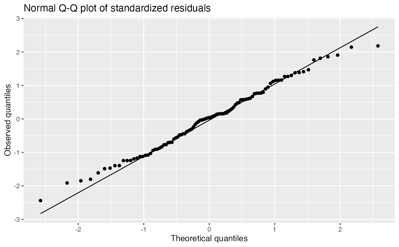
It is difficult for novices to judge normality from a Q-Q plot, so a lineup can be helpful:
model_lineup(fit) |>
  ggplot(aes(sample = .std.resid)) +
  geom_qq() +
  geom_qq_line() +
  facet_wrap(vars(.sample)) +
  labs(title = "Normal Q-Q plot of standardized residuals",
       x = "Theoretical quantiles", y = "Observed quantiles")
#> decrypt("gOh4 kDUD pB 9RtpUpRB Vw")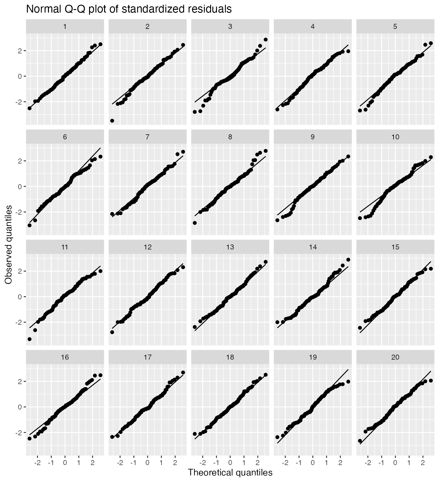
The true Q-Q plot does not stand out here, so we have little evidence for systematically non-normal residuals.
A case study
Let’s illustrate the use of these diagnostics on a real dataset: the Palmer Penguins data, giving measurements of 344 penguins in the Palmer Archipelago in Antarctica.
Let’s consider building a model of bill length as a function of flipper length and species:
penguin_1 <- lm(bill_length_mm ~ flipper_length_mm + species,
                data = penguins)
This model allows a different intercept per species, but not a different slope. Let’s plot the partial residuals for flipper length:
partial_residuals(penguin_1, flipper_length_mm) |>
  ggplot(aes(x = .predictor_value, y = .partial_resid)) +
  geom_point(aes(color = species)) +
  geom_smooth(aes(color = species), se = FALSE) +
  geom_line(aes(y = .predictor_effect)) +
  labs(x = "Flipper length (mm)", y = "Partial residual",
       color = "Species")
#> `geom_smooth()` using method = 'loess' and formula = 'y ~ x'
Here we can see that gentoo penguins tend to have longer flippers than Adélie and chinstrap penguins. Looking at the partial residuals in each group, there appear to be varying slopes: there is a consistent upward trend in the residuals for gentoo penguins relative to the overall trend, for instance. This suggests that perhaps there is an interaction, and the slope of the relationship differs for each species.
Let’s fit a new model with an interaction.
penguin_2 <- lm(bill_depth_mm ~ flipper_length_mm * species,
                data = penguins)
Now the residuals do not seem to have separate trends in each group:
partial_residuals(penguin_2, flipper_length_mm) |>
  ggplot(aes(x = .predictor_value, y = .partial_resid)) +
  geom_point(aes(color = species)) +
  geom_smooth(aes(color = species), se = FALSE) +
  geom_line(aes(y = .predictor_effect)) +
  labs(x = "Flipper length (mm)", y = "Partial residual",
       color = "Species")
#> `geom_smooth()` using method = 'loess' and formula = 'y ~ x'
We can now proceed to other diagnostics, such as checking for equal variance and normality of the residuals. Let’s make a Q-Q plot of the standardized residuals for each species from this fit:
augment(penguin_2) |>
  ggplot(aes(sample = .std.resid)) +
  geom_qq() +
  geom_qq_line() +
  facet_wrap(vars(species)) +
  labs(title = "Normal Q-Q plot of standardized residuals",
       x = "Theoretical quantiles", y = "Observed quantiles")
The residuals appear reasonably normally distributed, but notice the slopes are different for each species, indicating they have different variances. The residual variance appears to be largest for Adélie penguins and smallest for gentoo penguins. If we were using this model purely for prediction, this would not be a concern; but if we intend to conduct tests or produce confidence intervals, this may be an issue.
There are no obvious major outliers either in the partial residual plots or residual Q-Q plots, so we have no reason to suspect there are highly influential observations. Nonetheless, we can check the Cook’s distances:
augment(penguin_2) |>
  ggplot(aes(x = seq_along(.cooksd), y = .cooksd)) +
  geom_col() +
  labs(x = "Row index", y = "Cook's distance")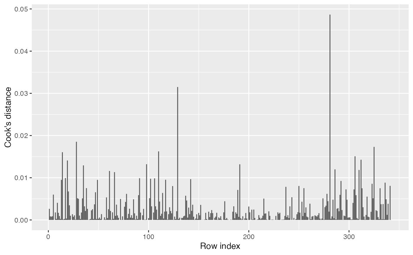
This looks fine. Even the most influential point still has a very small Cook’s distance.