library(dplyr)

flights <- read.csv("data/pit-flights.csv.gz")
airlines <- read.csv("data/pit-carriers.csv")16 Flight Delays
\[ \DeclareMathOperator{\E}{\mathbb{E}} \DeclareMathOperator{\R}{\mathbb{R}} \DeclareMathOperator{\RSS}{RSS} \DeclareMathOperator{\AIC}{AIC} \DeclareMathOperator{\bias}{bias} \DeclareMathOperator{\MSE}{MSE} \DeclareMathOperator{\VIF}{VIF} \DeclareMathOperator{\var}{Var} \DeclareMathOperator{\cov}{Cov} \DeclareMathOperator{\cor}{Cor} \DeclareMathOperator{\se}{se} \DeclareMathOperator{\trace}{trace} \DeclareMathOperator{\vspan}{span} \DeclareMathOperator{\proj}{proj} \newcommand{\condset}{\mathcal{Z}} \DeclareMathOperator{\cdo}{do} \newcommand{\ind}{\mathbb{I}} \newcommand{\T}{^\mathsf{T}} \newcommand{\X}{\mathbf{X}} \newcommand{\Y}{\mathbf{Y}} \newcommand{\Z}{\mathbf{Z}} \newcommand{\zerovec}{\mathbf{0}} \newcommand{\onevec}{\mathbf{1}} \newcommand{\trainset}{\mathcal{T}} \DeclareMathOperator*{\argmin}{arg\,min} \DeclareMathOperator*{\argmax}{arg\,max} \DeclareMathOperator{\SD}{SD} \newcommand{\dif}{\mathop{\mathrm{d}\!}} \newcommand{\convd}{\xrightarrow{\mathrm{D}}} \DeclareMathOperator{\logit}{logit} \newcommand{\ilogit}{\logit^{-1}} \DeclareMathOperator{\odds}{odds} \DeclareMathOperator{\dev}{Dev} \DeclareMathOperator{\sign}{sign} \DeclareMathOperator{\normal}{Normal} \DeclareMathOperator{\binomial}{Binomial} \DeclareMathOperator{\bernoulli}{Bernoulli} \DeclareMathOperator{\poisson}{Poisson} \DeclareMathOperator{\multinomial}{Multinomial} \DeclareMathOperator{\uniform}{Uniform} \DeclareMathOperator{\edf}{edf} \]
In this case study, we’ll analyze data on airline flights in the United States and their delays. The data, published by the Bureau of Transportation Statistics, is popular in examples and tutorials all across data science—there’s even an R package containing an extract to make it easier to include in examples. As there are examples all across the Internet with this data, I can give a sample data analysis with less worry that I’m giving something away and ruining someone’s carefully crafted homework assignment.
This case study is designed to provide a realistic research question that can be answered with regression. The question is phrased in business terms, rather than statistical terms, as statisticians must learn to translate research questions into statistical ones and translate statistical results into business and policy recommendations.
We’ll begin with a description of the data and problem before figuring out how to model it and giving a sample data analysis report.
16.1 Problem statement
16.1.1 Background
In the United States, the Bureau of Transportation Statistics records data on each airline flight conducted by US airlines over a certain size. The data includes the flight date, carrier, its scheduled departure and arrival times, and its actual departure and arrival times—allowing us to examine delays in detail.
16.1.2 Data
The data file pit-flights.csv.gz contains data on every flight from Pittsburgh International Airport in 2023 by the covered airlines.1 The variables include:
year,month,day: The date of the flightdep_time,sched_dep_time: The departure time and scheduled departure time of the flight, in 24-hour format (e.g. 505 = 5:05am, 1340 = 1:40 pm)dep_delay: Departure delay (minutes)arr_time,sched_arr_time,arr_delay: The arrival time and delay, in the same formatcarrier: The airline as a two-letter code (the IATA airline designator). The filepit-carriers.csvcontains a mapping to full airline names.flight: The airline’s flight number for this flighttailnum: The tail number (basically a serial number) for the airplane that flew the flightorigin: The origin airport (PIT for all flights)dest: The destination airport, as a three-letter FAA airport codeair_time: Time the flight spent in the air, in minutesdistance: Distance between the origin and destination, in mileshour,minute: Time of the scheduled departure, separated into hour and minutestime_hour: Date and hour of the flight in ISO 8601 timestamp form. (If you’re not familiar with dates and times in R, look at lubridate; itsymd_hms()function can automatically parse this into a date object, and its various accessor functions can extract different components of the date and time.)
16.1.3 Research questions
You have been hired by Indiana Airways, a budget carrier that is considering expanding to offering service from Pittsburgh.2 As a budget airline, they are extremely concerned about reducing costs.3 Delays are expensive because flight crews have to be paid for longer, and because passengers may miss connections (which Indiana Airways must rebook) or need refunds. Indiana Airways would like to understand typical delays for flights from Pittsburgh so they can plan their service.
Specifically, the Senior Associate Vice President for Operations has several questions:
- Which times of year and days of the week have the most delays? Compare both the fraction of flights delayed more than 15 minutes and the typical delay amounts.
- Some airline staff believe that departure delays are less important on longer flights, as the pilots have more time to make up for the delay by flying faster or adjusting their route. Does this appear to occur in the data—that is, do pilots seem to make up for departure delays on longer flights, compared to shorter ones?
Write a report analyzing the data and answering these questions.
16.2 Exploration
Before starting any data analysis task, we should do exploratory data analysis. We have three goals:
- Ensure we understand what the data represents and what each observation means.
- Identify any problems, missing data, typos, and so on.
- Make plots that could help answer the research questions or indicate what methods we should use to do so.
Often the first two can be done together, as we check the data and check our understanding of it.
16.2.1 Understanding and checking the data
Let’s start by loading the data.
We observe there are 42,130 rows. In Table 16.1 I’ve printed 10 rows from the data, selecting out a few of the key variables we might use. As expected, all the flights are from PIT (Pittsburgh). According to a random great circle distance calculator I found online, the distance from Pittsburgh to Denver (DEN) is 1,290 miles, matching the distance shown for the first flight, so the distance units are correct.
| time_hour | flight | carrier | dep_time | sched_dep_time | dep_delay | origin | dest | air_time | distance |
|---|---|---|---|---|---|---|---|---|---|
| 2023-01-01T05:00:00Z | 67 | WN | 505 | 500 | 5 | PIT | DEN | 194 | 1290 |
| 2023-01-01T05:00:00Z | 137 | WN | 509 | 510 | -1 | PIT | TPA | 128 | 873 |
| 2023-01-01T05:00:00Z | 43 | WN | 540 | 540 | 0 | PIT | BWI | 44 | 210 |
| 2023-01-01T06:00:00Z | 114 | AA | 555 | 600 | -5 | PIT | PHL | 46 | 268 |
| 2023-01-01T06:00:00Z | 198 | YX | 555 | 600 | -5 | PIT | EWR | 52 | 319 |
| 2023-01-01T06:00:00Z | 49 | AA | 556 | 600 | -4 | PIT | MIA | 141 | 1013 |
| 2023-01-01T06:00:00Z | 122 | DL | 559 | 600 | -1 | PIT | ATL | 80 | 526 |
| 2023-01-01T06:00:00Z | 123 | UA | 600 | 600 | 0 | PIT | IAH | NA | 1117 |
| 2023-01-01T06:00:00Z | 50 | WN | 602 | 605 | -3 | PIT | MCO | 116 | 834 |
| 2023-01-01T06:00:00Z | 4 | WN | 604 | 605 | -1 | PIT | MDW | 121 | 402 |
The times match the described format, but there’s one problem. Notice that each time in the time_hour column ends with Z; that’s the time zone code for Greenwich Mean Time. Depending on Daylight Saving Time, Pittsburgh is 4 or 5 hours behind GMT, so 5:00Z is about midnight in Pittsburgh. What time zone is the data in? At most airports, the first flights of the day are around 5 or 6am, and arriving flights end around midnight. Let’s make a histogram of the departure hours as recorded in the time_hour column:
library(lubridate)
library(ggplot2)

# hour() and ymd_hms() from lubridate:
flights |>
  mutate(hour = hour(ymd_hms(time_hour))) |>
  ggplot(aes(x = hour)) +
  geom_histogram(binwidth = 1) +
  labs(x = "Departure hour", y = "Flights")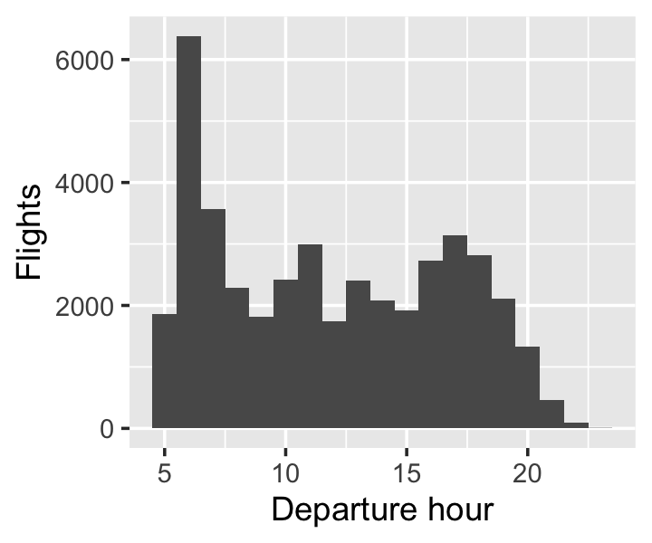
The flights are indeed between about 5am and 10-11pm, so these times are clearly local time, not Greenwich Mean Time—the data is mislabeled.4 We’ll keep this in mind when reporting results about the times of day with the most delays.
Next, let’s examine the delay amounts. Outliers here could throw off our analysis. The code below uses patchwork to put two ggplots side-by-side.
library(patchwork)

g1 <- ggplot(flights, aes(x = dep_delay)) +
  geom_histogram() +
  labs(x = "Departure delay (minutes)",
       y = "Flights")

g2 <- ggplot(flights, aes(x = arr_delay)) +
  geom_histogram() +
  labs(x = "Arrival delay (minutes)",
       y = "Flights")

g1 | g2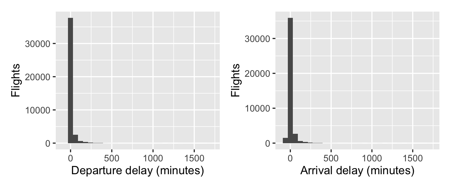
But if you run this code yourself, you’ll notice there were two warning messages:
Warning messages:
1: Removed 544 rows containing non-finite outside the scale range (`stat_bin()`).
2: Removed 637 rows containing non-finite outside the scale range (`stat_bin()`).
That’s concerning. Let’s check the summaries of the delay variables to see what “non-finite” values there might be:
summary(flights$dep_delay) Min. 1st Qu. Median Mean 3rd Qu. Max. NA's
-40.000 -7.000 -4.000 7.476 2.000 1709.000 544 summary(flights$arr_delay) Min. 1st Qu. Median Mean 3rd Qu. Max. NA's
-65.000 -18.000 -9.000 1.525 4.000 1703.000 637 So there are NAs—missing values—for about 1% of flights. It’s not clear why they might be missing, so we will look at an extract of a few flights with missing values below.
flights |>
  filter(is.na(arr_delay)) |>
  select(time_hour, carrier, flight, dep_time, sched_dep_time,
         dep_delay, arr_time, sched_arr_time) |>
  head(n = 5) |>
knitr::kable()| time_hour | carrier | flight | dep_time | sched_dep_time | dep_delay | arr_time | sched_arr_time |
|---|---|---|---|---|---|---|---|
| 2023-01-01T06:00:00Z | UA | 123 | 600 | 600 | 0 | 1229 | 828 |
| 2023-01-02T08:00:00Z | YX | 227 | 821 | 830 | -9 | 1133 | 958 |
| 2023-01-02T16:00:00Z | G4 | 160 | NA | 1627 | NA | NA | 1900 |
| 2023-01-02T05:00:00Z | WN | 67 | NA | 505 | NA | NA | 650 |
| 2023-01-03T13:00:00Z | 9E | 228 | NA | 1310 | NA | NA | 1440 |
In some of them, the departure time is present, but there is no arrival time. Perhaps these were flights that were diverted or returned to the original airport due to problems. In others, there is no departure or arrival time. It’s possible these flights were simply canceled. (Indeed, the first table I found on Google with information about canceled flights indicated about 1-2% are canceled, matching the rate of missingness.)
So what do we do with these flights? Indiana Airways didn’t say anything about cancellations, and we don’t know how or why they were canceled. In principle, a canceled flight is a major delay—passengers have to wait until the next flight with empty seats—but we don’t know how much of a delay. Hence we can’t include these flights in average delay calculations, but we could choose to count them when calculating the fraction of delayed flights, making it the fraction of delayed or canceled flights. On the other hand, Indiana Airways doesn’t have to pay its pilots for not flying, so perhaps they don’t care. We will omit these flights in our analysis, but ideally we would ask Indiana Airways if we could.
16.2.2 Plotting the research questions
Let’s try to make plots and tables that can help answer the research questions. First, what times of year and days of week have the most delays? Indiana Airlines did not say whether arrival or departure delays are most important, but we can infer: it is the arrival delay that determines if a customer will miss their connecting flight at the next airport, and the flight crew are being paid until the flight arrives at its destination, so arrival delays are what matter for costs. Let’s plot them by month and day of week.
g1 <- ggplot(flights, aes(x = factor(month), y = arr_delay)) +
  geom_boxplot(alpha = 0.5) +
  labs(x = "Month", y = "Arrival delay (minutes)")

# wday() is from lubridate
g2 <- ggplot(flights, aes(x = wday(time_hour, label = TRUE), y = arr_delay)) +
  geom_boxplot(alpha = 0.5) +
  labs(x = "Day of week", y = "Arrival delay (minutes)")

g1 | g2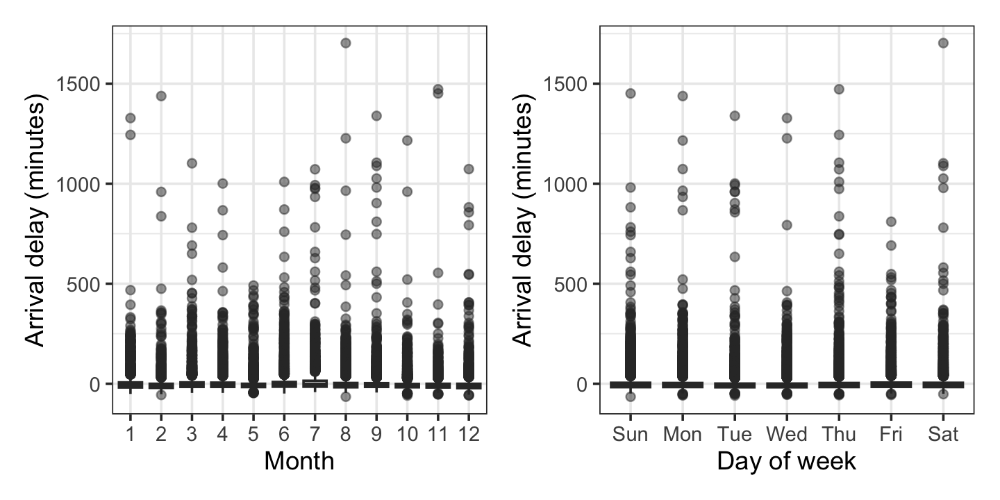
But because the delay distributions are so skewed, as we saw above, these boxplots are nearly useless. More detailed plots by month, day, or hour would be hard to read because of how many plots would be necessary. This calls for tables. We’ve used knitr’s kable() function before, but for beautiful tables for publications, gt is like ggplot for tables.
library(gt)

flights |>
  filter(!is.na(arr_delay)) |>
  # use lubridate to turn month numbers into text:
  mutate(month = month(time_hour, label = TRUE, abbr = FALSE)) |>
  group_by(month) |>
  summarize(arr_mean = mean(arr_delay),
            arr_median = median(arr_delay),
            arr_75 = quantile(arr_delay, probs = 0.75),
            pct_delayed = mean(arr_delay > 15),
            n = n()) |>
  gt() |>
  tab_header(title = "Flight delays from Pittsburgh") |>
  tab_spanner(label = "Arrival delay",
              columns = c(arr_mean, arr_median, arr_75)) |>
  cols_label(month = "Month",
             arr_mean = "Mean",
             arr_median = "Median",
             arr_75 = "75th pct.",
             pct_delayed = "% delayed",
             n = "Flights") |>
  fmt_number(arr_mean, decimals = 1) |>
  fmt_number(c(arr_75, n), decimals = 0) |>
  fmt_percent(pct_delayed, decimals = 1) |>
  cols_align("left", month) |>
  data_color(
    method = 'numeric',
    columns = c(pct_delayed),
palette = "ggsci::red_material")| Flight delays from Pittsburgh | |||||
| Month |
Arrival delay
|
% delayed | Flights | ||
|---|---|---|---|---|---|
| Mean | Median | 75th pct. | |||
| January | 2.9 | -9 | 7 | 18.4% | 3,299 |
| February | −4.3 | -12 | 0 | 11.9% | 3,049 |
| March | 4.3 | -7 | 7 | 18.0% | 3,579 |
| April | 3.5 | -7 | 6 | 15.9% | 3,450 |
| May | −2.9 | -9 | 0 | 10.3% | 3,618 |
| June | 8.6 | -6 | 9 | 20.5% | 3,431 |
| July | 11.9 | -6 | 15 | 24.4% | 3,464 |
| August | 2.6 | -10 | 4 | 15.1% | 3,669 |
| September | 3.7 | -8 | 3 | 14.9% | 3,341 |
| October | −3.5 | -10 | −1 | 10.6% | 3,742 |
| November | −4.6 | -11 | 0 | 10.0% | 3,496 |
| December | −4.4 | -12 | 0 | 10.9% | 3,355 |
It’s clear that the worst delays are in June and July—not December, when you’d expect the holiday rush and winter weather to cause problems. January comes in third, perhaps because the worst winter weather in Pittsburgh is in January and February, not December.
We can make similar plots or tables for days of the week and hours of the day, but to avoid redundancy, we’ll display those below in the report.
To explore the second research question, that departure delays may be less important on longer flights than shorter ones, a plot is not immediately obvious. There are three variables in question: departure delay, arrival delay, and distance. (We use distance instead of total flight time, which is also in the data, for reasons explored in Exercise 2.9.) We would need a 3D plot to visualize them all at once, which would be hard to read.
Instead, let’s consider the gain: the difference between departure and arrival delay. A positive value indicates the arrival delay is smaller than the departure delay, and so the pilots made up lost time somehow. How does the gain vary with distance?
ggplot(flights, aes(x = distance, y = dep_delay - arr_delay)) +
  geom_point(alpha = 0.5) +
  geom_smooth() +
  labs(x = "Distance (miles)", y = "Delay gain (minutes)")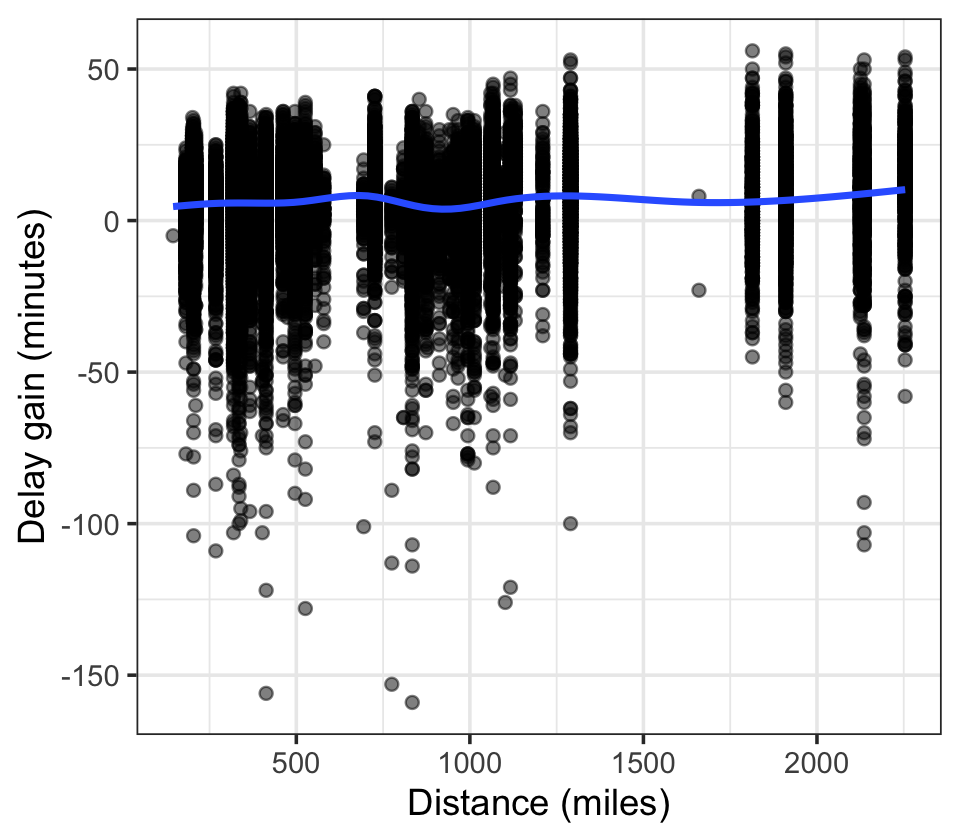
The relationship is not particularly strong. But notice the largest gains (over 50 minutes) are on flights over 1,000 miles, while the smallest gains (delays over 2 hours) are on flights under 1,000 miles. Perhaps there is a relationship, and perhaps it will become clearer when we control for time of year and other factors.
However, the plot also hints at a serious problem. Notice how the flights over 1,500 miles appear in vertical lines. That’s because there are only a few major airports with flights from Pittsburgh greater than that distance:
flights |>
  filter(distance > 1500) |>
  count(dest)
dest n
1 LAS 844
2 LAX 361
3 PHX 463
4 SEA 435
5 SFO 478
6 SLC 2If the arrival delay is affected by the destination in any way, perhaps because of local air traffic control policies or how busy the airports typically are, then distance is confounded with destination: the long flights are only to certain destinations. Perhaps pilots can make up for delays when flying to Las Vegas (LAS), Los Angeles (LAX), Phoenix (PHX), Seattle (SEA), or San Francisco (SFO), not because of their distance but because of how those airports work. We would not be able to determine this from our data. Additionally, those airports may be served by only certain airlines that have different procedures from those doing shorter flights:
flights |>
  filter(distance > 1500) |>
  count(carrier) |>
  arrange(desc(n))
carrier n
1 NK 787
2 WN 612
3 UA 478
4 AS 435
5 AA 268
6 DL 2
7 G4 1flights |>
filter(distance < 500) |>
count(carrier) |>
arrange(desc(n)) carrier n
1 YX 10872
2 AA 3782
3 WN 3332
4 B6 1155
5 OO 1034
6 UA 1013
7 9E 904
8 OH 775
9 NK 560
10 MQ 323
11 DL 278
12 G4 210Indeed, long flights tend to be on airlines like Southwest (WN) and Spirit (NK), while short flights tend to be on carriers like Republic Airways (YX), who operate short-haul flights for American, Delta, and United.
16.3 Modeling decisions
Next, we need to decide how to answer the research questions using the statistical methods we have covered so far.
Research question 1, on the times and days with the most delays, does not seem to require any modeling or inference. It will be sufficient to display plots or tables highlighting the differences in delay rates.
Research question 2, on whether pilots make up for departure delays on longer flights, may require modeling. The gain variable defined above seems like a reasonable response, in which case the research question is: is the gain larger for longer-distance flights?
This suggests a model of gain ~ distance, and the research question asks for the sign on distance. But is that sufficient, or would it be useful to control for other variables? Figure 16.1 shows a causal diagram of the relevant variables, based on considerations discussed above in the EDA. Different airlines operate flights to different destinations, and so their flights have different distances; they may also have different flight policies that affect how much pilots try to make up for delays. Perhaps different destinations have different air traffic control policies that affect the possible gain. And destination affects the choice of departure times—airlines schedule flights based on time zones and time changes that affect the local time when the flight arrives at the destination. Finally, perhaps the amount of departure delay affects the gain: on a flight that’s not delayed, pilots don’t try to speed up, but on delayed flights, pilots try to gain some extra minutes before arrival.
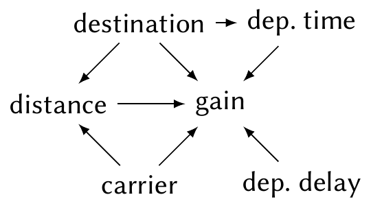
The diagram suggests we should control for the air carrier as a possible confounding variable. We would control for destination, but as every flight is from Pittsburgh, destination and distance are perfectly correlated—each destination has only one possible distance. So we cannot control for it without making the model perfectly collinear. The consideration about departure delays suggests we should include an interaction or otherwise allow the distance \(\to\) gain relationship to depend on departure delay.
16.4 Producing a report
Now we must translate this analysis into a report. Chapter 25 describes the basic structure we’ll use. Our report will omit the code and only show plots and tables that are important—that is, important for the reader to understand to interpret our results.
The report is annotated with various notes commenting on its style and structure. Review these notes for more information on designing a good report.
16.5 The report
Note
Thanks to Erin Franke for contributions to this sample report.
16.5.1 Executive summary
Flight delays are common in aviation travel and frustrating for both the passenger and company alike. From the company side, the primary concern with delays is their cost, as crews are kept overtime and passengers need refunds or rebookings. As a result, understanding both when delays occur and how to minimize them is an important component to the financial well-being of airline companies. In this paper, we analyze arrival delay patterns from all flights departing from Pittsburgh International Airport (PIT) in 2023. Using our findings, we advise Indiana Airways, a budget airline company interested in expanding service to Pittsburgh, on how to schedule their flights with the goal of minimizing delays.
We find that arrival delays are most prevalent on flights departing PIT on weekends and evenings. Arrival delays are also most common in the summer months. Using a multiple linear regression model, we go on to find that longer flights provide more opportunity for pilots to make up for departure delays in comparison to shorter flights. As a result of our analysis, we advise Indiana Airways to expand to PIT in the form of a business travel airline, allowing them to schedule the majority of their flights on weekday mornings. Limitations of our analysis include that we do not account for canceled flights and that there is a lack of independence between flights (a delay in one flight could cause delays in others).
16.5.2 Introduction
Flight delays are a common issue in aviation travel. Not only are they frustrating for passengers, but also for airline companies. Delays are expensive because these companies must pay their flight attendants overtime and passengers may miss connections, leading them needing to be rebooked or refunded. As a result, it is important for airline companies to understand both (a) when delays occur and (b) what can be done to make up for them, especially when considering expanding service to additional cities.
In this analysis, we provide Indiana Airways, a budget airline company interested in expanding to Pittsburgh, with insights on arrival delays so they can best plan their service. Our data comes from the Bureau of Transportation Statistics and includes every flight departing from Pittsburgh International Airport (PIT) in 2023. We find that delays are most prevalent during the summer months, with about 22.5% of flights leaving PIT in June and July of 2023 seeing arrival delays longer than 15 minutes. Flights departing in the evening and on weekends are also more susceptible to delays. Due to some level of delays being unavoidable, we also consider whether pilots are able to make up for departure delays on longer flights in comparison to shorter ones. Using a multiple linear regression model, we find that for flights with no departure delay, flight crews can gain an additional 0.21 minutes (95% CI [0.17, 0.251]) for each 100 miles of additional flight distance, on average. In order to best reduce costly delays, we recommend Indiana Airways expand to Pittsburgh by selling themselves as a business travel airline, allowing them to schedule the majority of their flights on weekday mornings.
16.5.3 Data
TipData description and “Table 1”
Notice that we give a detailed summary of the flights from Pittsburgh in Table 16.2. This is a classic “Table 1”: as described in Section 25.1.3, we typically give tables describing the data so readers understand the sample and can judge whether it is representative of the population they’re interested in. For instance, if Indiana Airways is interested only in routes of certain distances, they can judge if our sample is appropriate for that.
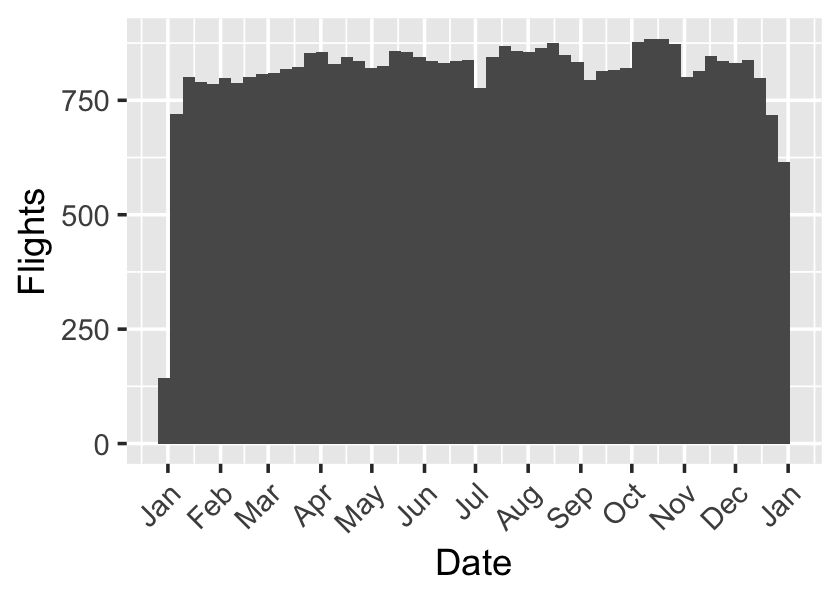
Our data includes all flights from Pittsburgh International Airport by 14 major air carriers during 2023, as reported to the Bureau of Transportation Statistics. Relevant flight information provided includes each flight’s date, scheduled departure and arrival time, departure and arrival delay (in minutes), flight destination, flight distance, and carrier. A breakdown of carriers and distances is shown in Table 16.2. There are 42,130 flights in total, spread relatively evenly throughout the year, as shown in Figure 16.2.
| On time | Delayed | Flights | |
|---|---|---|---|
| Distance | |||
| 750-1500 miles | 80% | 20% | 10,729 |
| < 750 miles | 87% | 13% | 28,818 |
| > 1500 miles | 81% | 19% | 2,583 |
| Airline | |||
| Republic Airways | 91% | 9% | 10,896 |
| Delta Air Lines | 89% | 11% | 2,700 |
| Pinnacle Airlines | 88% | 12% | 965 |
| SkyWest Airlines | 87% | 13% | 2,014 |
| United Airlines | 86% | 14% | 2,875 |
| PSA Airlines | 85% | 15% | 775 |
| Envoy Air | 83% | 17% | 437 |
| Alaska Airlines | 82% | 18% | 435 |
| Southwest Airlines | 82% | 18% | 9,452 |
| American Airlines | 82% | 18% | 5,929 |
| Allegiant Air | 81% | 19% | 1,320 |
| JetBlue Airways | 79% | 21% | 1,155 |
| Frontier Airlines | 76% | 24% | 180 |
| Spirit Airlines | 74% | 26% | 2,997 |
| Total | |||
| 85% | 15% | 42,130 | |
Of these flights, 637 have missing departure or arrival delay information, perhaps because the flights were canceled or diverted from their intended destination. As these flights do not provide complete delay information and are a small proportion of the total number of flights, they are excluded from our analysis. However, in some ways, canceled flights can be thought of as major delays. They will cause additional expenses for Indiana Airways, such as rebooking passengers. Therefore, not accounting for cancellations is one limitation of our analysis. Another limitation to our analysis is that we do not have the reason for delay. It would be ideal to know if flights were delayed because of weather, crew members running late, equipment malfunctions, high air traffic volume, or other reasons. It is plausible that the reason for delay could be associated with both the flight distance and the amount of time that the pilot can make up in the air, making it a confounding variable. For example, shorter flights are often done on smaller planes that are more susceptible to bad weather, and bad weather may prevent the pilot from making up time.
16.5.4 Methods
16.5.4.1 Delay analysis
To identify the times of year and days of week with the most delays, we will break flights down by month and day and calculate mean, median, and 75th percentile arrival delays. We will also calculate the proportion of flights delayed more than 15 minutes. We study arrival delays rather than departure delays because it is late arrivals that cause customers to miss connections and cause flight crews to remain on duty past their scheduled hours, so controlling arrival delays is of paramount importance to Indiana Airways.
16.5.4.2 Delay gains analysis
To study whether pilots can make up for departure delays on longer flights by flying faster, we examine delay gains: the difference between departure delay and arrival delay for each flight. A positive gain indicates the flight was less delayed at arrival than it was at departure, suggesting the flight crew made up for lost time. If longer-distance flights have higher gains than shorter-distance flights, then perhaps crews have a deliberate strategy of catching up from departure delays.
We constructed a linear regression to predict gain using distance, while controlling for air carrier, as different carriers fly different routes (affecting distance) and may have different policies and procedures (affecting their reaction to delays), making carrier a confounding variable. We also include an interaction term between flight distance and length of departure delay in our model. This is important because the effect of departure delay on delay gain is unlikely to be constant across flights of different distances. Finally, we control for day of the week and month to account for effects of air traffic volume and weather.
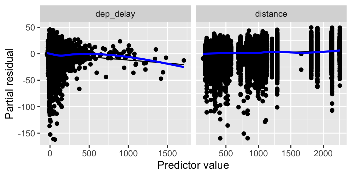
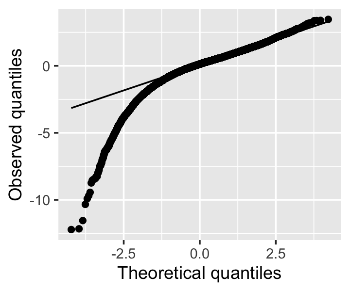
Partial residual diagnostics (shown in Figure 16.3) did not find signs of nonlinearity, so we did not test nonlinear or additive models. However, residual variances are severely heteroskedastic when plotted against departure delay, and the residual distribution is severely skewed, as shown in Figure 16.4. The large sample size means the non-normality is not a serious concern, but to account for the heteroskedasticity, we will use the sandwich estimator for all inference. One assumption that is broken is the assumption of independent observations—for instance, delays in one flight may cause delays in another flight.
16.5.5 Results
16.5.5.1 Delays by time of year, time of day, and day of week
| Flight delays from Pittsburgh | |||||
| Month |
Arrival delay
|
% delayed | Flights | ||
|---|---|---|---|---|---|
| Mean | Median | 75th pct. | |||
| January | 2.9 | -9 | 7 | 18.4% | 3,299 |
| February | −4.3 | -12 | 0 | 11.9% | 3,049 |
| March | 4.3 | -7 | 7 | 18.0% | 3,579 |
| April | 3.5 | -7 | 6 | 15.9% | 3,450 |
| May | −2.9 | -9 | 0 | 10.3% | 3,618 |
| June | 8.6 | -6 | 9 | 20.5% | 3,431 |
| July | 11.9 | -6 | 15 | 24.4% | 3,464 |
| August | 2.6 | -10 | 4 | 15.1% | 3,669 |
| September | 3.7 | -8 | 3 | 14.9% | 3,341 |
| October | −3.5 | -10 | −1 | 10.6% | 3,742 |
| November | −4.6 | -11 | 0 | 10.0% | 3,496 |
| December | −4.4 | -12 | 0 | 10.9% | 3,355 |
Arrival delays by time of year are shown in Table 16.3. Unexpectedly, the largest average delays are in July rather than during the busy holiday season (November and December) or the depths of winter (January and February), with 12-minute average delays in July versus on-time or early arrivals in November and December. Nearly 25% of flights in July are delayed more than 15 minutes, versus only 10% during the holiday season, and 18% in January. This may be due to summer thunderstorms and severe weather systems.
| Flight delays by day of week | ||||||||
| Day |
Arrival delay
|
Delay gain
|
% delayed | Flights | ||||
|---|---|---|---|---|---|---|---|---|
| Mean | Median | 75th pct. | Mean | Median | 75th pct. | |||
| Sun | 3.1 | -9 | 5 | 6.2 | 8 | 14 | 16.1% | 6,075 |
| Mon | 1.3 | -9 | 4 | 5.8 | 7 | 14 | 14.6% | 6,137 |
| Tue | −1.6 | -10 | 1 | 6.1 | 8 | 14 | 12.4% | 5,806 |
| Wed | −0.4 | -10 | 1 | 6.7 | 8 | 14 | 13.1% | 5,859 |
| Thu | 1.9 | -9 | 4 | 5.7 | 7 | 14 | 15.3% | 6,245 |
| Fri | 3.3 | -7 | 6 | 4.8 | 7 | 13 | 17.5% | 6,170 |
| Sat | 3.0 | -8 | 5 | 6.2 | 7 | 14 | 16.2% | 5,201 |
Delays also vary by day of week, as shown in Table 16.4. The largest average arrival delays occur Friday through Sunday, with over 16% of flights being delayed more than 15 minutes, despite Saturday being the least-busy day for departures from Pittsburgh. This may be due to different scheduling or staffing practices on weekends, or congestion elsewhere in the country that affects Pittsburgh flights. Table 16.4 also shows that typical delay gains are consistent from day to day, around 5 minutes, so there is no major change in delay practices throughout the week.
| Flight delays from Pittsburgh | ||||||||
| Time |
Arrival delay
|
Delay gain
|
% delayed | Flights | ||||
|---|---|---|---|---|---|---|---|---|
| Mean | Median | 75th pct. | Mean | Median | 75th pct. | |||
| 5-9am | −4.0 | -11 | −1 | 6.7 | 8 | 15 | 8.9% | 13,928 |
| 9am-noon | −3.7 | -12 | −2 | 7.3 | 9 | 14 | 9.9% | 7,124 |
| Noon-3pm | 1.1 | -8 | 4 | 5.7 | 7 | 13 | 15.1% | 6,163 |
| 3-6pm | 9.2 | -5 | 12 | 3.8 | 6 | 13 | 22.2% | 7,610 |
| 6-9pm | 10.5 | -4 | 15 | 5.0 | 7 | 13 | 25.0% | 6,109 |
| 9pm-midnight | 8.1 | -6 | 16 | 8.7 | 10 | 18 | 25.8% | 559 |
By contrast, Table 16.5 shows typical delays by time of day. Afternoon and evening departures, from about 3pm onward, are most likely to have delays more than 15 minutes, while morning flights arrive at their destinations, on average, slightly early. Only 9-10% of early morning flights are delayed, versus 25% of flights past 6pm. One possible mechanism is that delays compound throughout the day: aircraft typically make several flights each day, and so a mechanical problem or thunderstorm early in the day can cause cascading delays throughout the day.
16.5.5.2 Delay gain analysis
TipPresenting the regression
Observe that the linear regression model we chose is shown only in the form of Table 16.6: there is no regression equation written out. In most fields, readers know what linear regression is, so it is sufficient to tell them what the predictors are; a mathematical formula is redundant (and often hard to read). See Section 25.4 on how to produce tables like this.
| Characteristic | Beta | 95% CI | p-value |
|---|---|---|---|
| (Intercept) | 3.56 | 1.75, 5.37 | <0.001 |
| Distance (mi) | 0.002 | 0.002, 0.003 | <0.001 |
| Departure delay (min) | -0.012 | -0.018, -0.006 | <0.001 |
| Month | |||
| 1 | — | — | |
| 2 | 3.21 | 2.46, 3.96 | <0.001 |
| 3 | -0.611 | -1.34, 0.116 | 0.10 |
| 4 | 0.221 | -0.487, 0.929 | 0.5 |
| 5 | 2.52 | 1.84, 3.20 | <0.001 |
| 6 | 0.843 | 0.124, 1.56 | 0.021 |
| 7 | 0.248 | -0.494, 0.989 | 0.5 |
| 8 | 2.27 | 1.58, 2.97 | <0.001 |
| 9 | 0.817 | 0.117, 1.52 | 0.022 |
| 10 | 3.22 | 2.56, 3.88 | <0.001 |
| 11 | 3.15 | 2.46, 3.83 | <0.001 |
| 12 | 5.54 | 4.81, 6.28 | <0.001 |
| Airline | |||
| Alaska Airlines | — | — | |
| Allegiant Air | -5.65 | -7.38, -3.92 | <0.001 |
| American Airlines | -2.30 | -3.91, -0.685 | 0.005 |
| Delta Air Lines | 1.87 | 0.228, 3.51 | 0.026 |
| Envoy Air | -0.657 | -2.69, 1.37 | 0.5 |
| Frontier Airlines | 0.386 | -2.28, 3.05 | 0.8 |
| JetBlue Airways | -2.14 | -3.84, -0.446 | 0.013 |
| Pinnacle Airlines | 4.51 | 2.69, 6.33 | <0.001 |
| PSA Airlines | -4.29 | -6.18, -2.40 | <0.001 |
| Republic Airways | 1.06 | -0.586, 2.70 | 0.2 |
| SkyWest Airlines | 2.05 | 0.373, 3.73 | 0.017 |
| Southwest Airlines | 0.054 | -1.52, 1.63 | >0.9 |
| Spirit Airlines | -2.69 | -4.32, -1.06 | 0.001 |
| United Airlines | -1.06 | -2.68, 0.552 | 0.2 |
| Day of week | |||
| 1 | — | — | |
| 2 | -0.520 | -0.988, -0.052 | 0.029 |
| 3 | -0.393 | -0.875, 0.089 | 0.11 |
| 4 | 0.165 | -0.305, 0.634 | 0.5 |
| 5 | -0.432 | -0.902, 0.038 | 0.071 |
| 6 | -1.46 | -1.95, -0.977 | <0.001 |
| 7 | -0.198 | -0.692, 0.297 | 0.4 |
| Distance (mi) * Departure delay (min) | 0.000 | 0.000, 0.000 | 0.070 |
| Abbreviation: CI = Confidence Interval | |||
Our regression model for predicting delay gain is shown in Table 16.6. Notably, the model predicts that for flights with no departure delay, flight crews can gain an additional 0.21 minutes (95% CI [0.17, 0.251]) for each 100 miles of additional flight distance. However, it also predicts that for each additional minute of departure delay, the gain decreases by 0.0119 minutes (95% CI [0.0176, 0.00618]).
Because of the interaction between delay and distance, this prediction is for flights of 0 distance. However, the interaction is not statistically significant (\(t(41459) = 1.8\), \(p = 0.0702\)), though its point estimate is positive (\(\hat \beta = 7.2\times 10^{-6}\), 95% CI \([-5.9\times 10^{-7}, 1.5\times 10^{-5}]\)).
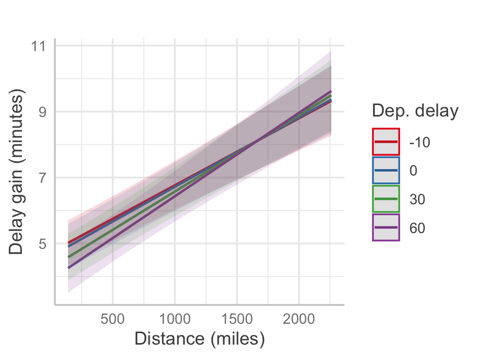
The fit is illustrated in Figure 16.5, the effects plot for distance and delay gains. Longer-distance flights indeed have higher average delay gains, suggesting pilots are able to make up for lost time. The interaction implies that when departure delays are longer, short flights are unable to make up the delay, while longer flights are able to speed up further and produce higher gains. This matches what we might expect if pilots attempt to make up for delays on longer flights, though the overall average delay gain is small, indicating this effect cannot mitigate delays more than 5 or 10 minutes.
16.5.6 Discussion
Note
Notice the use of effect sizes in the Discussion. This section is for the Senior Associate Vice President, who wants to know about flight delays, not the details of statistical methods, so the text is qualitative and emphasizes effect sizes, such as “a few minutes of delay”. As the effects are small and perhaps unimportant, it does not present them with great numerical precision.
Using data from the 42,130 flights that departed from Pittsburgh International Airport in 2023, our analysis finds that arrival delays are most prevalent in June and July, with the average flight reaching its destination roughly ten minutes late. The holiday season (November and December), surprisingly, has the highest rate of flights arriving on time. We also find that flights departing Monday–Thursday or in the morning see arrival delays at a lower rate than weekend flights, or flights departing after 3pm. Regarding to the Vice President’s question on delay gains, we find evidence that pilots can make up more time on longer-distance flights. However, the expected delay gain for the longest flights leaving PIT is less than ten minutes, indicating that departure delays longer than this will typically still arrive late.
In light of this information, we recommend Indiana Airways cater to those traveling for business as opposed to leisure. Doing so will allow the company to schedule the majority of their flights to leave weekday mornings as opposed to weekends and evenings, when delays are most prevalent. Indiana Airways may also want to consider prioritizing longer flights over shorter flights. With longer flights, it will be easier for the pilot to make up on lost time should there be a departure delay—though this can typically only make up for a few minutes of delay.
However, more research is needed. In a quick analysis comparing flights over 1,500 miles to those under 1,500 miles, 18.5% of these longer flights were delayed more than 15 minutes, in comparison 14.8% of shorter flights. Based on the analysis we have done, it unclear if the time made up in the air by longer flights will actually be enough to regularly prevent key issues such as passengers missing their connecting flights.
Our analysis is not without limitations.5 First, we assume that a delay in one flight does not lead to delays in other departing flights, which is unlikely to be true and could affect our findings about flight length and delay gain. Future work could use more advanced methods to account for this. Second, while only roughly 1–2% of flights are canceled, these cancellations could have expensive implications for Indiana Airways and we have not factored them into our analysis. Lastly, while we can recommend Indiana Airways cater to business passengers by flying primarily weekday morning flights, we do not know the demand for these flights. The Vice President should look into this; it could be that despite costly delays, weekend and evening flights are more profitable due to having more passengers on board.
The data is compressed by gzip due to its size. R’s
read.csv()and readr’sread_csv()functions can decompress gzip files automatically, so you do not need to do anything special to load the data.↩︎No trademarks were harmed in the making of this case study. Indiana Airways had their license revoked by the FAA in early 1980 for safety violations (Wewe 1980).↩︎
That’s why they hired you, a student, not a fancy business consultant.↩︎
I used the anyflights package to download the data, and this seems to be a bug in its data cleaning code. Fortunately it’s not a serious problem for us, but it would be if we had flights from multiple airports in different time zones and we needed to know which flights happened first.↩︎
So feel free to not take our recommendations and just wing it :) Thanks for reading this first-class joke; hope it landed.↩︎